Terraformation Survival Rate Calculations
Back to Projects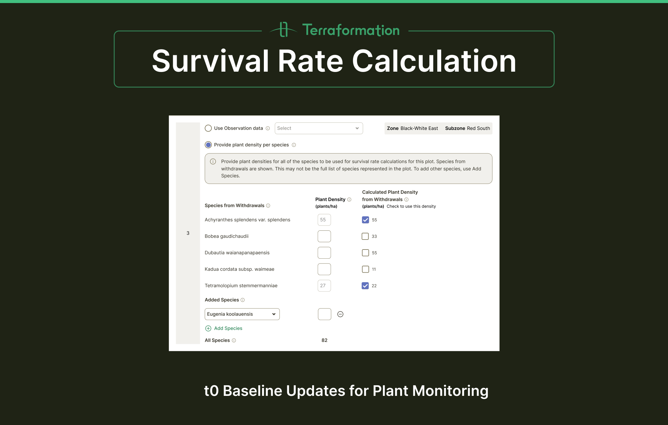

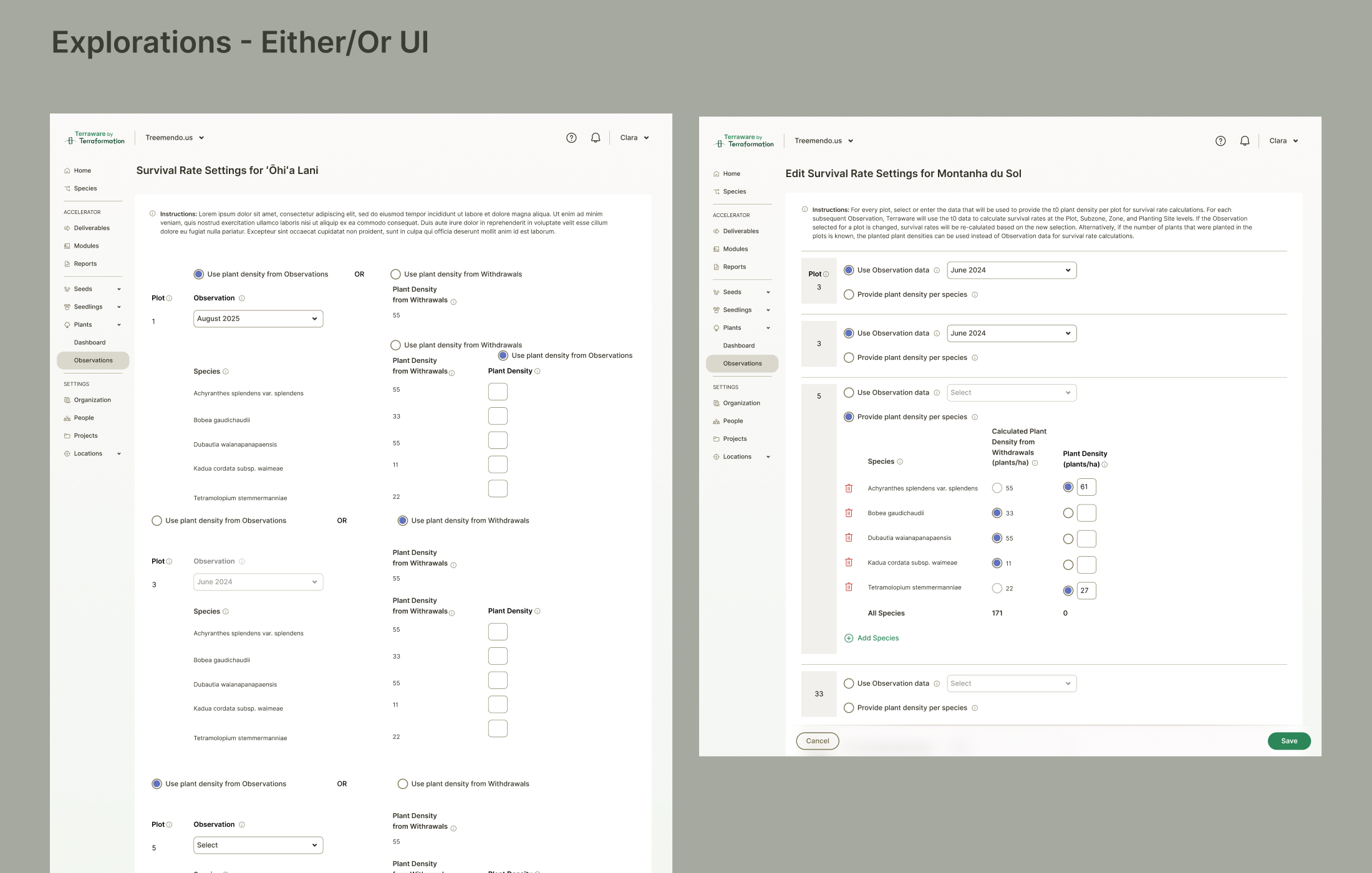
The Challenge
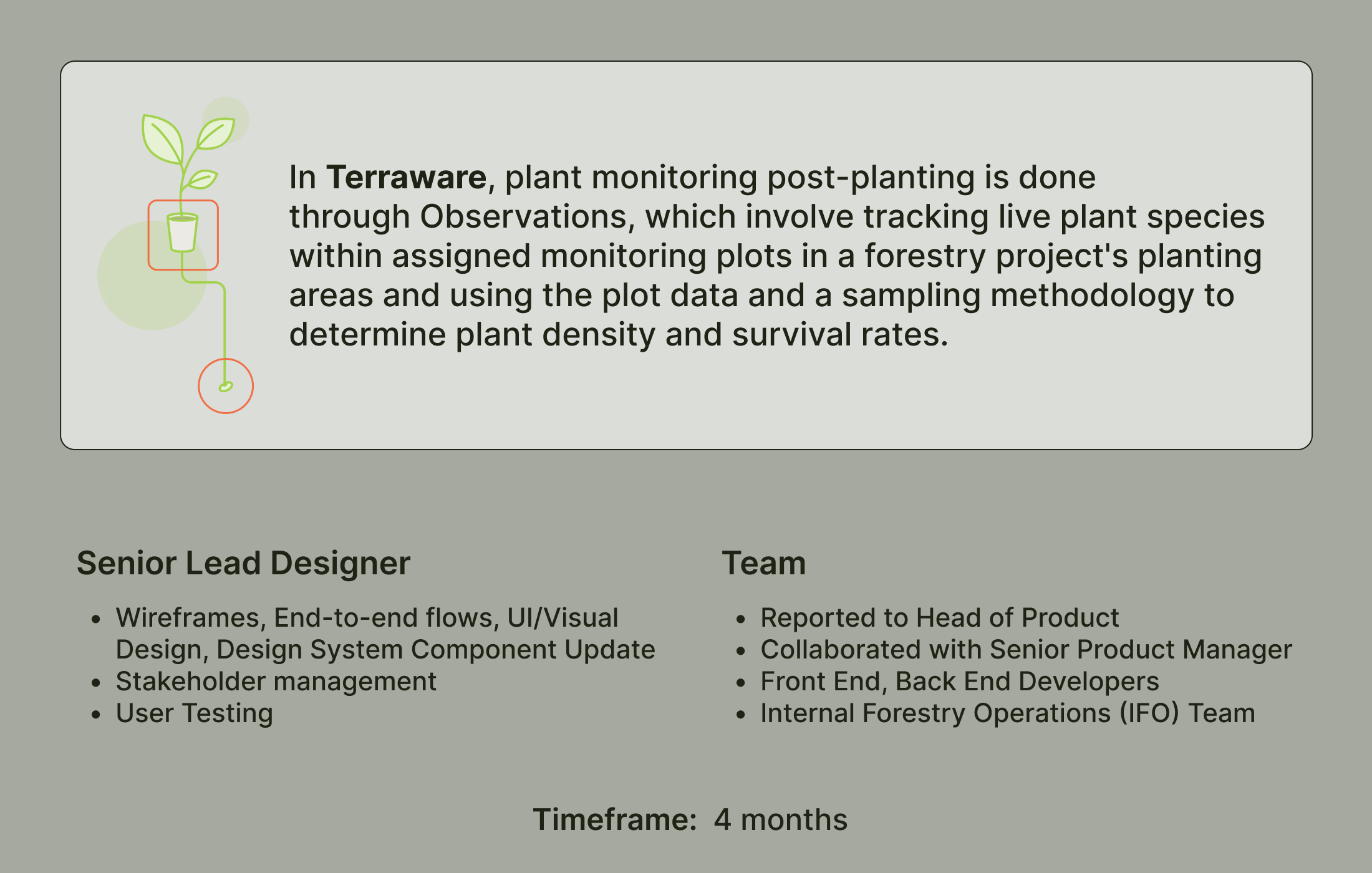
The project involved shifting terminology from mortality rate to survival rate for plant health monitoring. This wasn't a simple mathematical inversion — it required complex backend calculations, making the interface design critical for ensuring data accuracy across diverse planting configurations.
Understanding Complexity
The science team needed to input initial plant density data (t0 baseline) across potentially 25+ differently configured plots with three input types. This complexity made it challenging to design an interface that was both comprehensive and usable in the field.
Design Exploration
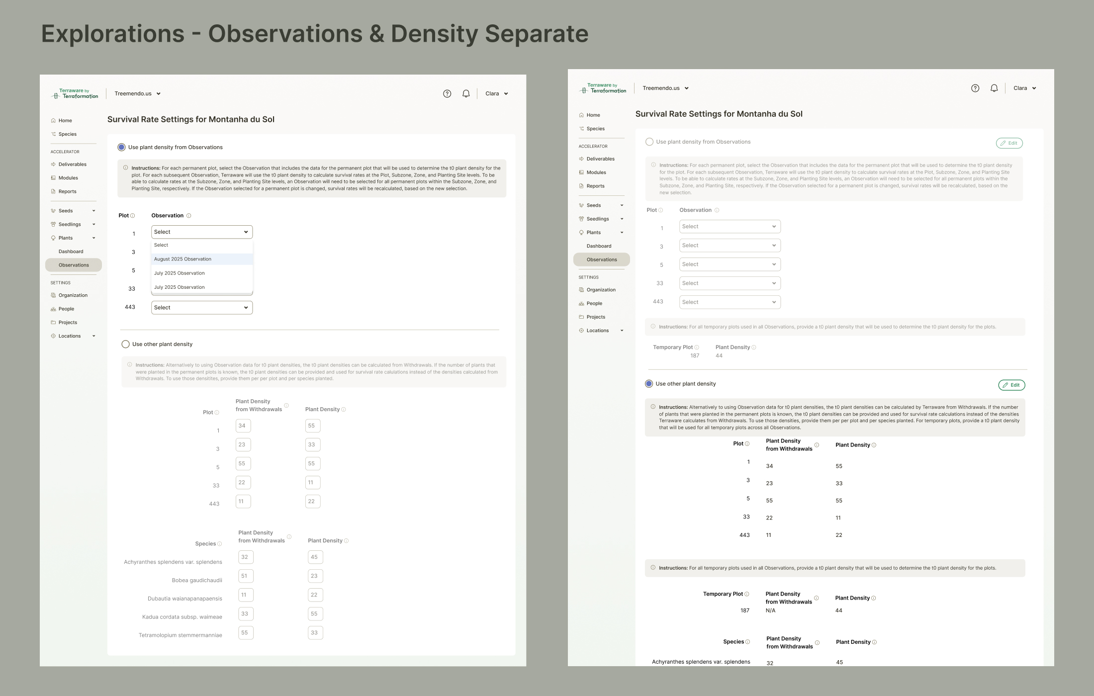
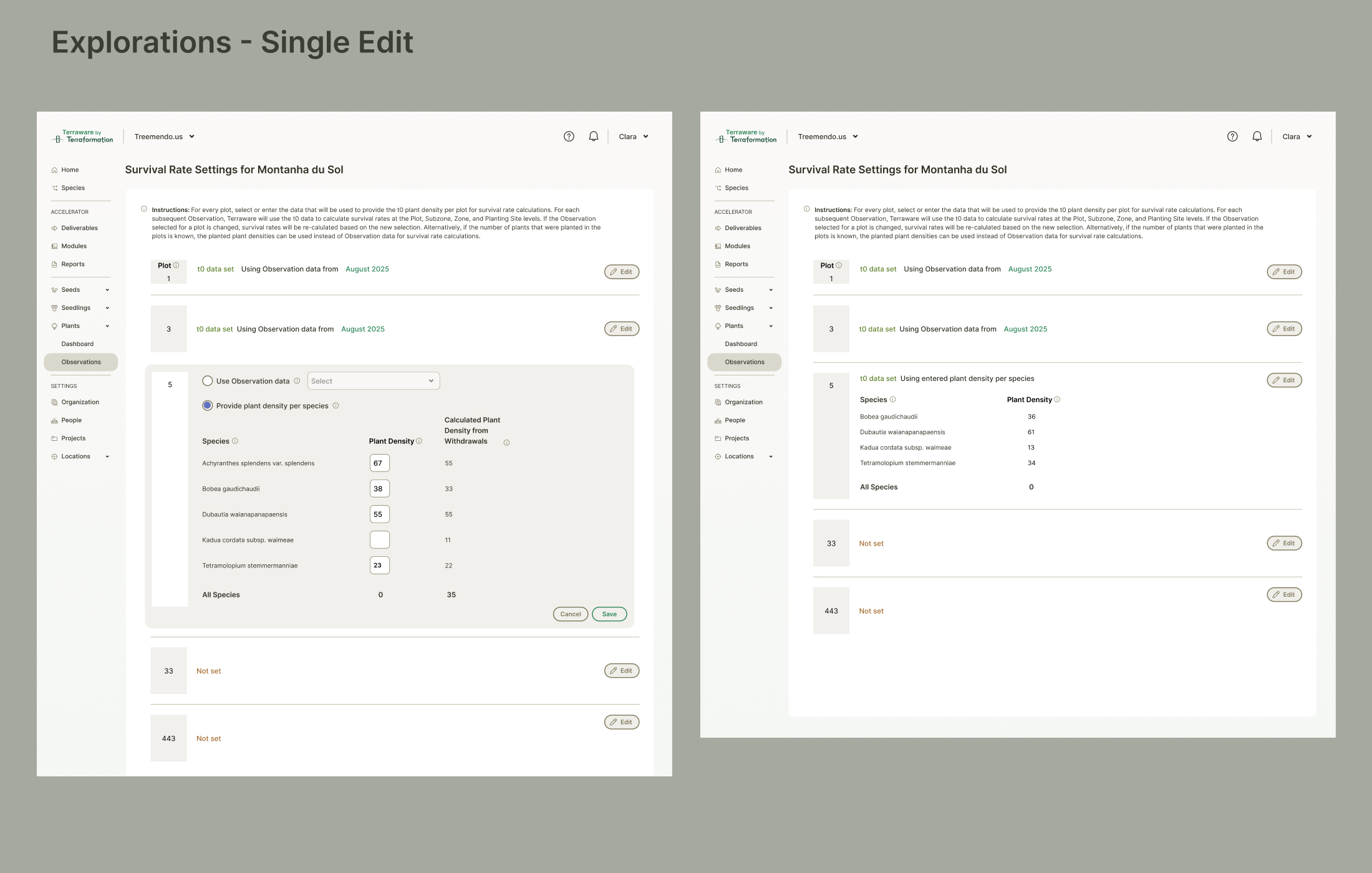
The first iteration separated observation-level data from species-specific densities — but failed because users needed to see observation dates paired with densities for accuracy. The second iteration used a focused, single-edit paradigm that proved too tedious for comparing plot-level data simultaneously. The final solution consolidated functionality using smart defaults and merged add/delete operations into simplified workflows requiring minimal user clicks.
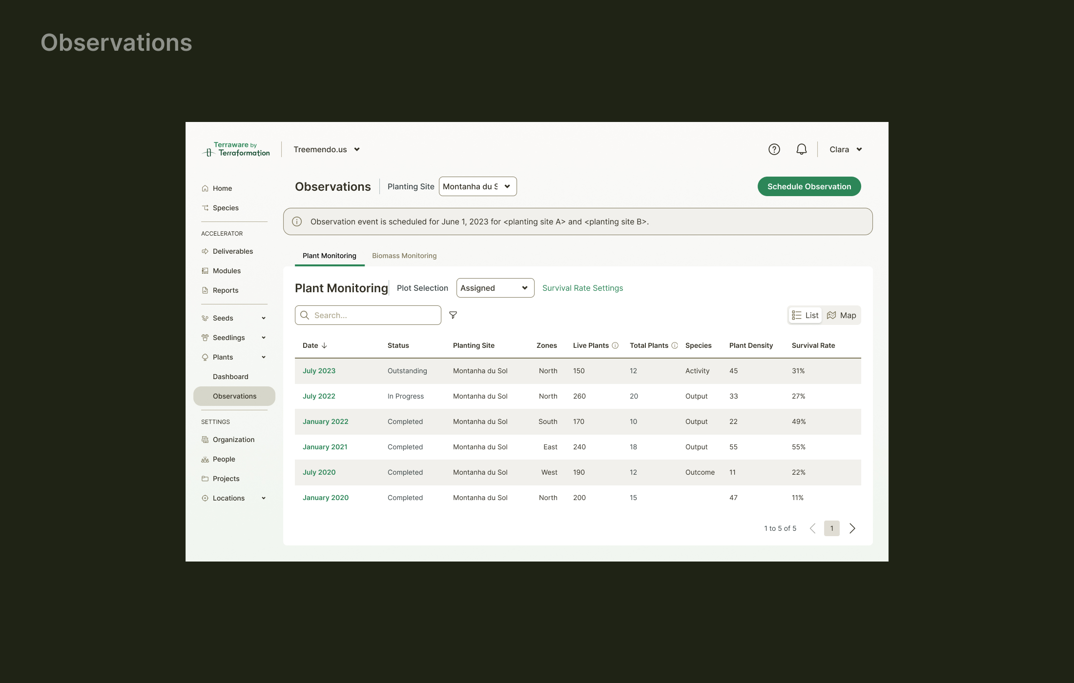
Observation Management
The design displays all relevant data while allowing selective editing through streamlined interactions. Users can view observation history and make targeted updates efficiently without losing context across plots.
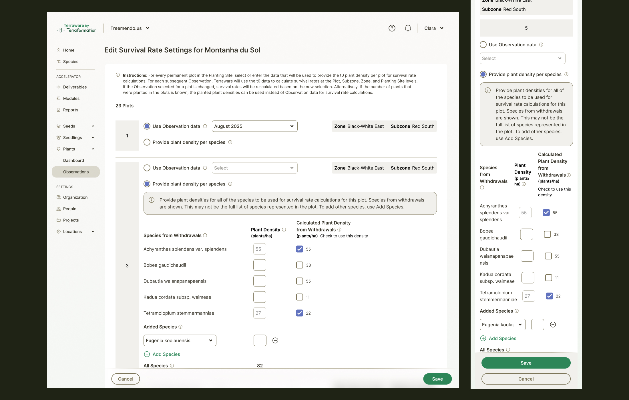
Edit Workflow
The edit interface balances comprehensiveness with usability — providing all necessary fields while using sensible defaults to reduce cognitive load and prevent accidental data changes.

Metrics & Visualization
Survival rate metrics are visualized clearly, helping teams understand plant health trends across different plots and species over time.