Terraware Visual Updates
Back to Projects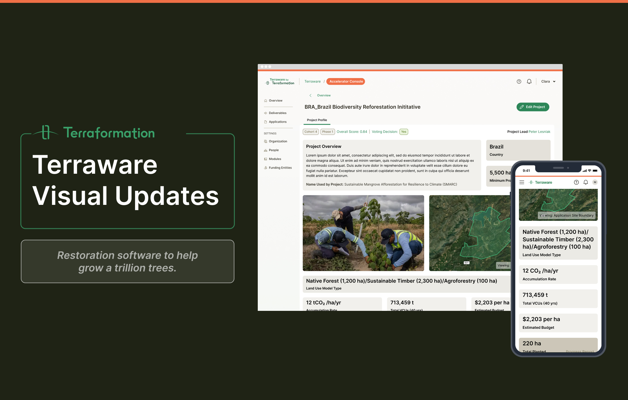
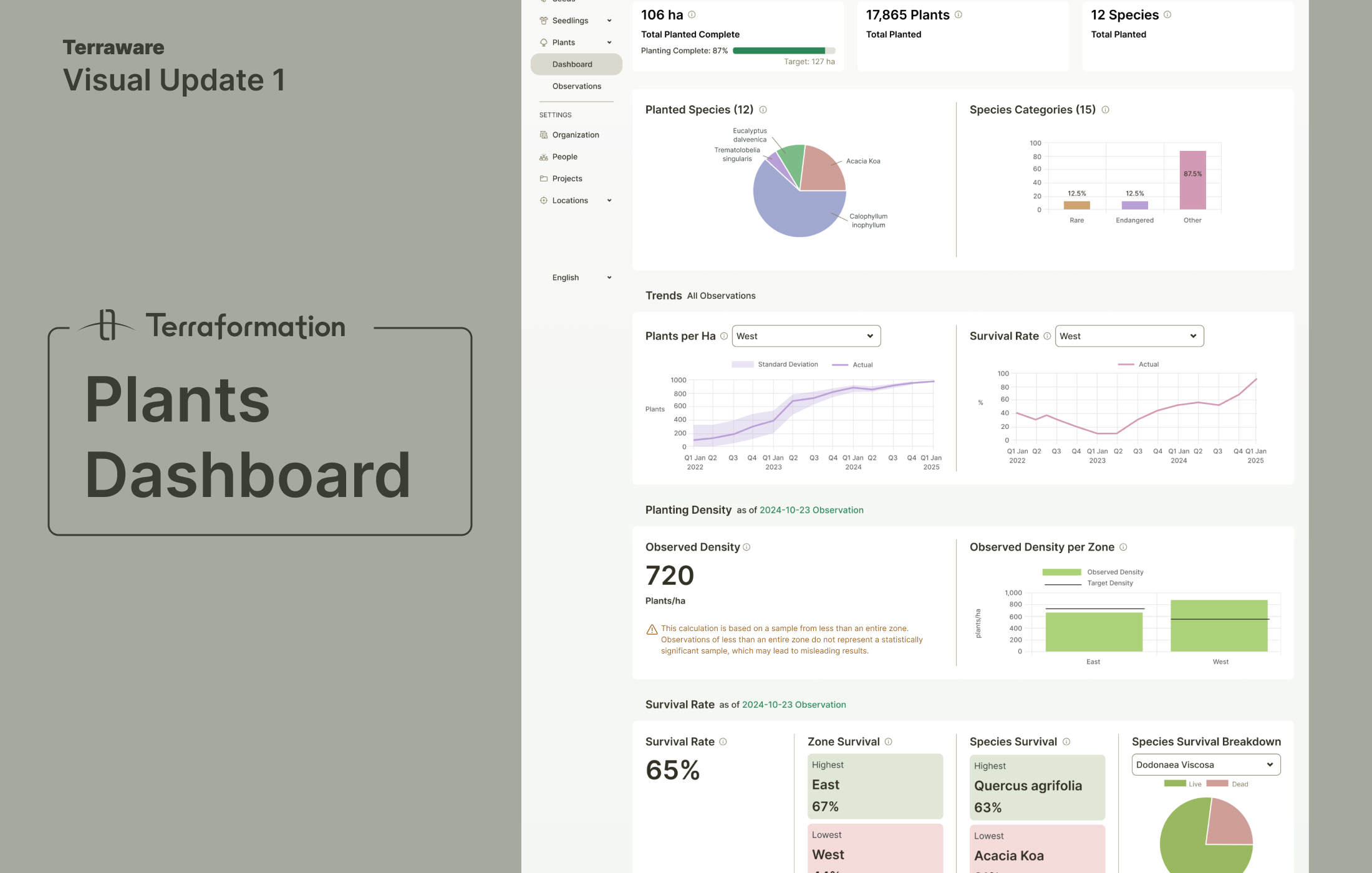
Plants Dashboard Redesign
The original Plants Dashboard was disorganized, text-heavy, and cluttered. I led a comprehensive redesign to improve information hierarchy, update charts with semantic colors, and enlarge the map for better usability. Key metrics now appear prominently at the top, and users can select multiple sites with dynamic updates.
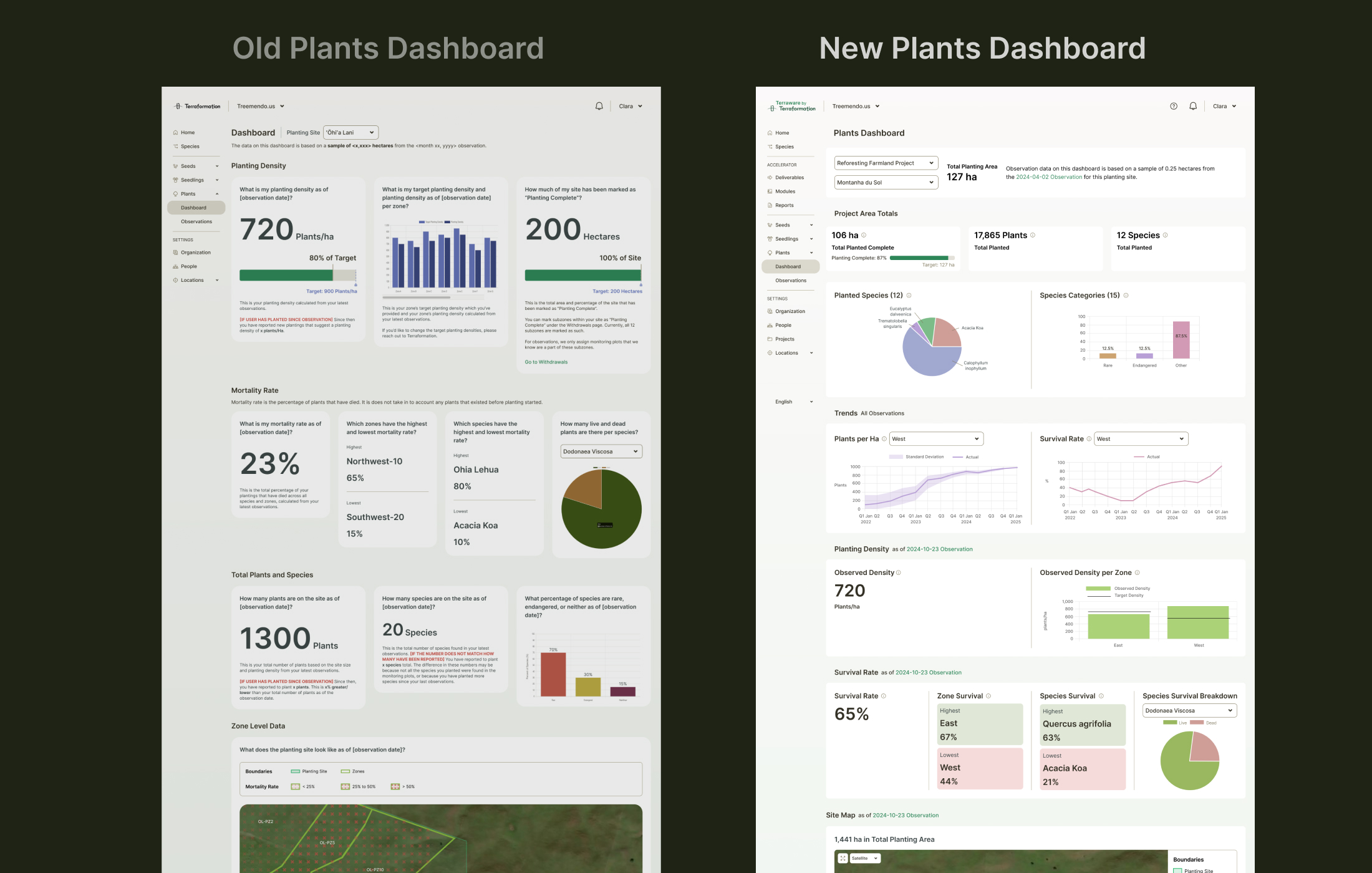
Before & After
The transformation shows how strategic visual design can turn a confusing interface into a clear, actionable dashboard. Redundant elements were removed, information was reorganized by importance, and the overall layout was made significantly more scannable.
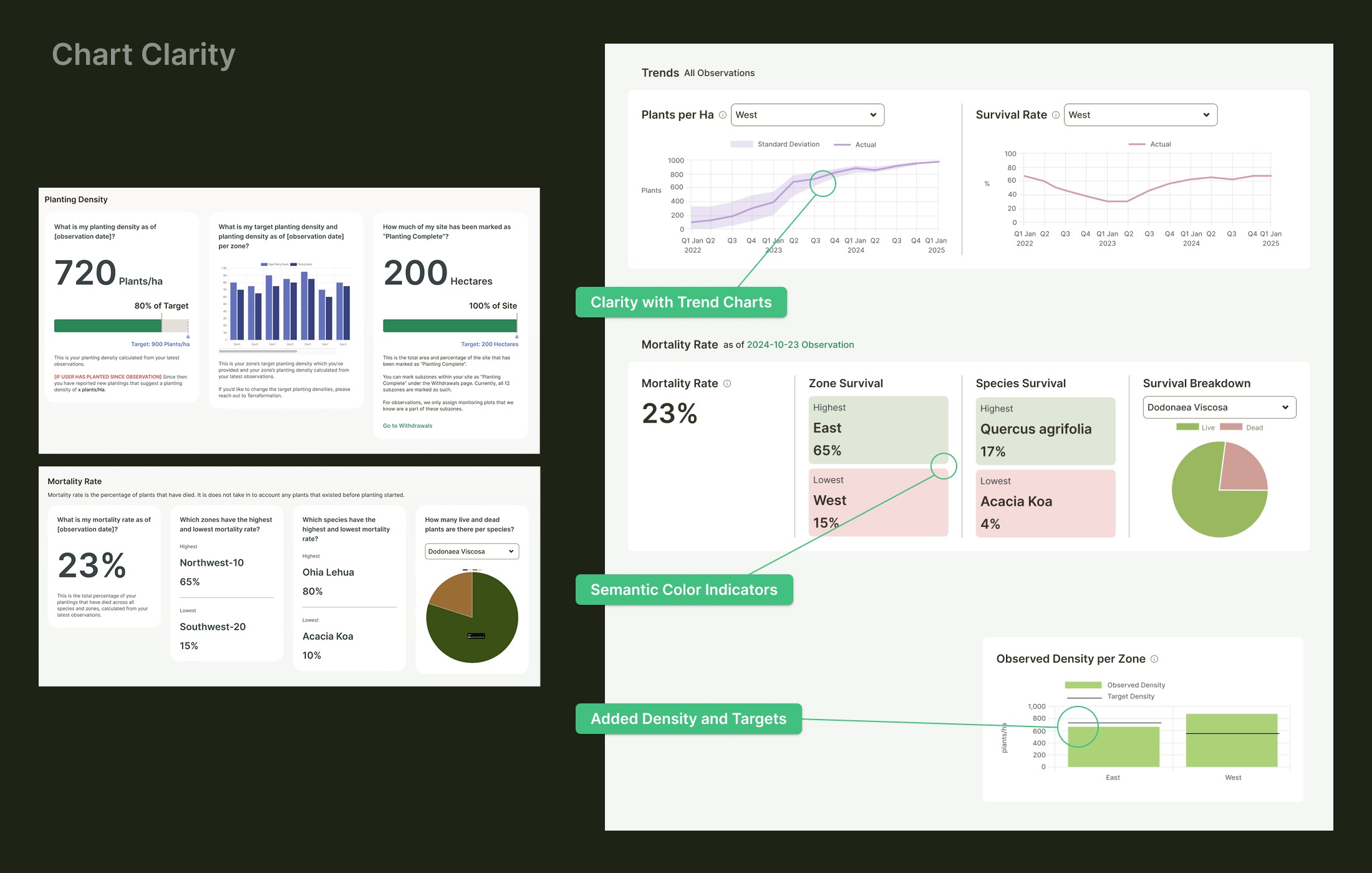
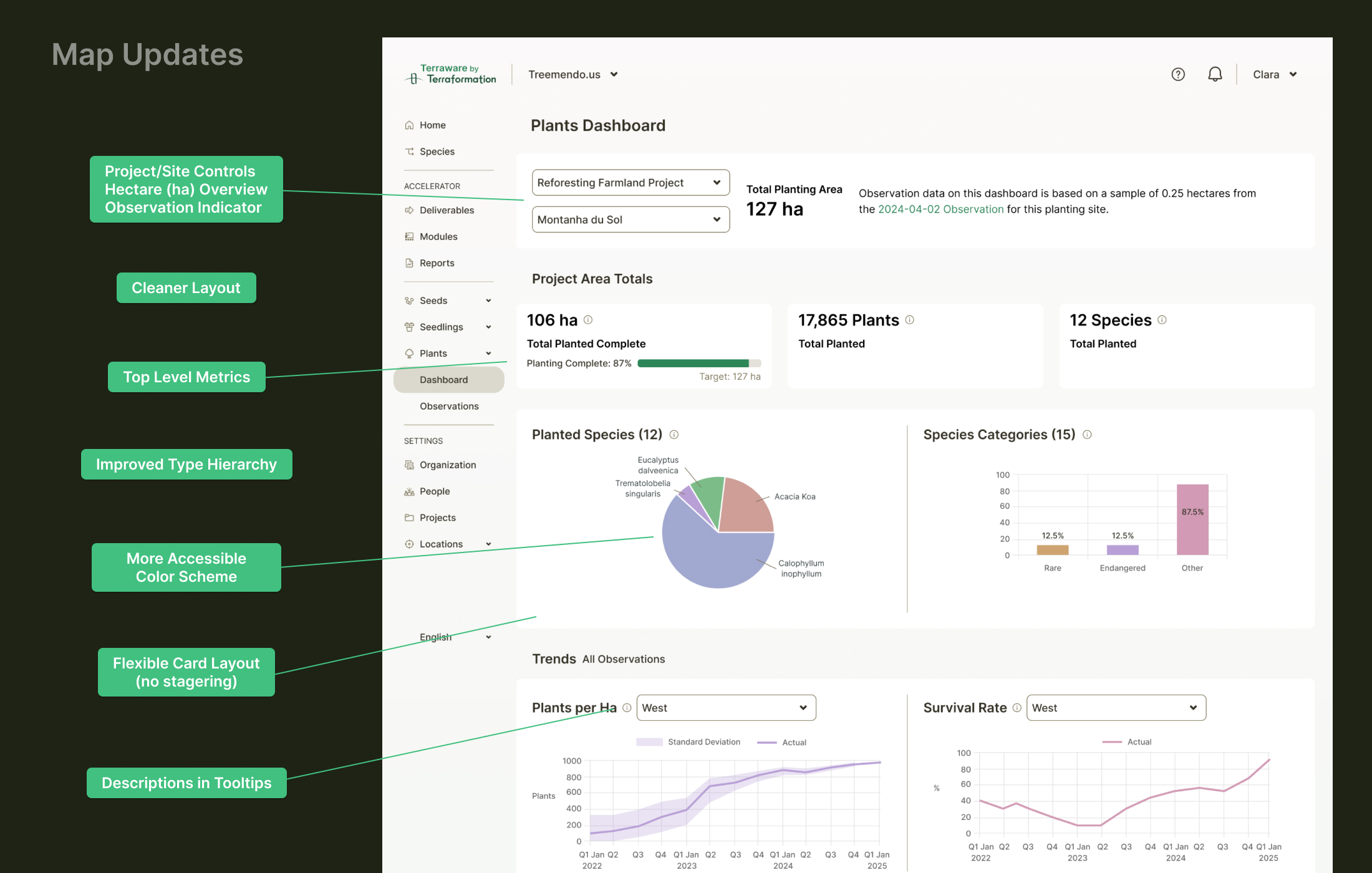
Chart & Data Visualization
I replaced ineffective original charts with more relevant alternatives, implementing accessible color schemes that better convey information for forestry teams. The new visualizations make it easier to spot trends and anomalies across planting sites.
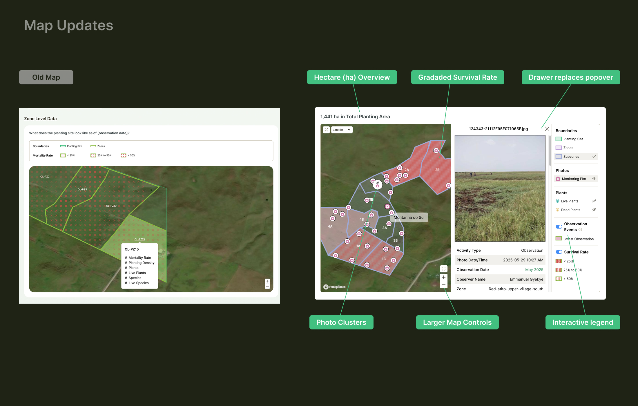
Interactive Map Enhancement
Working closely with the GIS team, I overhauled the map functionality with an interactive legend featuring multivariate controls, collapsible drawers, and photo clustering. This collaboration resulted in best-practice multi-variate overlays that provide meaningful spatial insights.
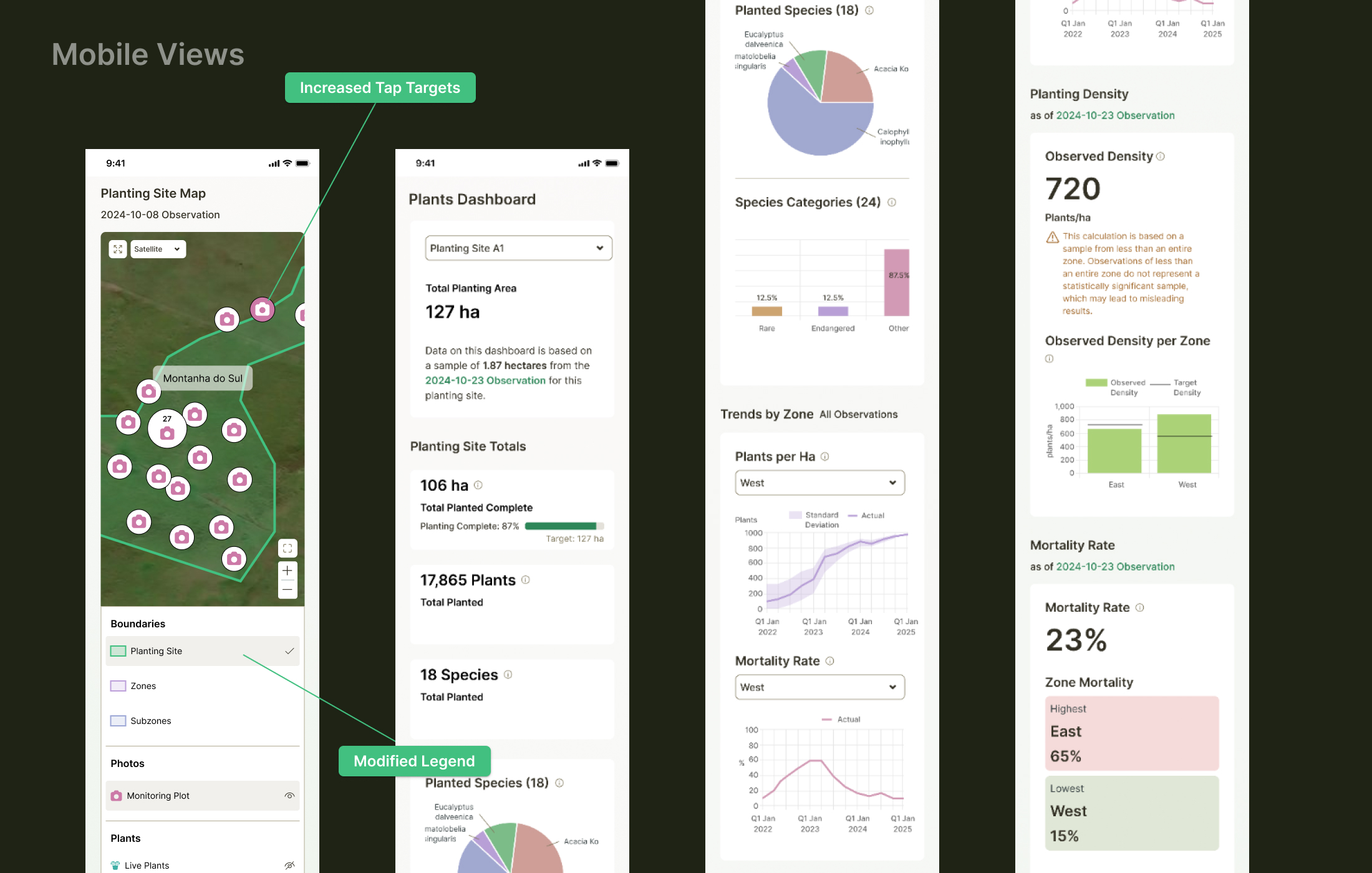
Mobile Experience
The redesign extends to mobile devices, ensuring forestry teams can access critical information in the field where they need it most.
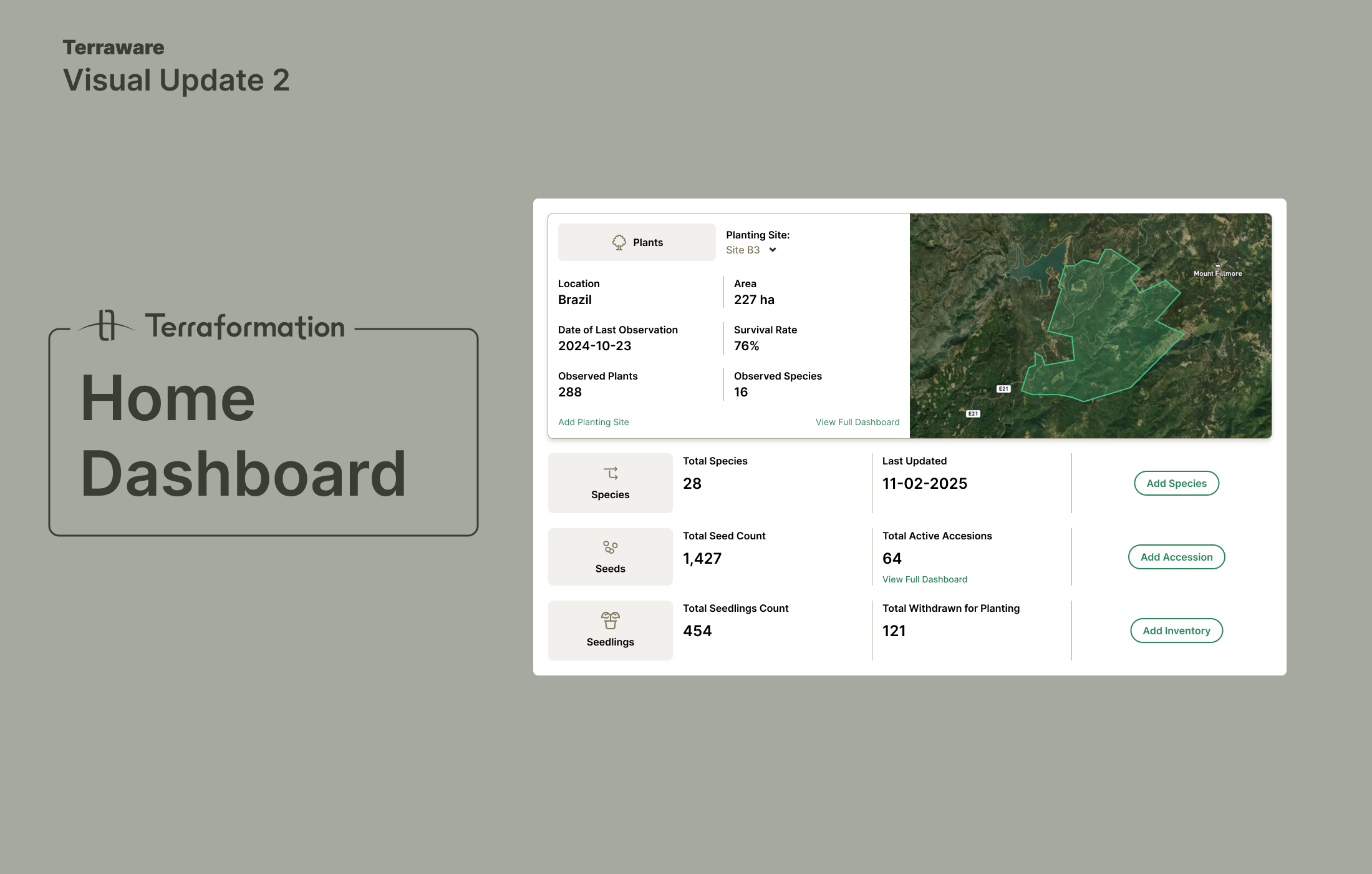
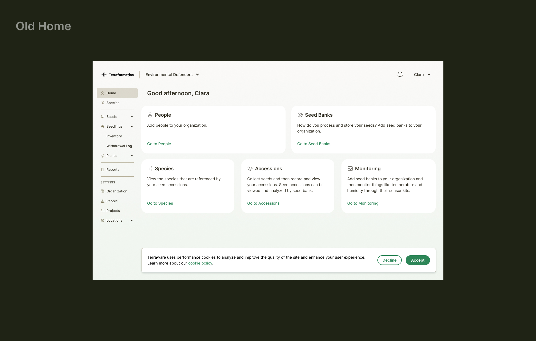
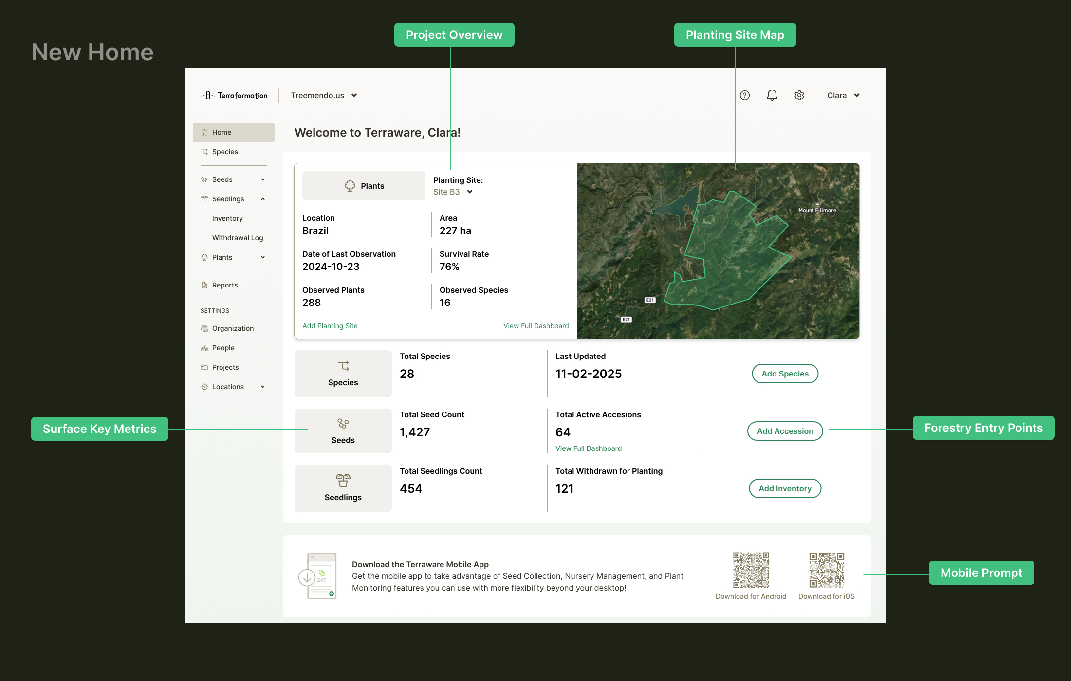
Home Screen Transformation
The original home screen was simply a list of redundant links. I transformed it into a content-rich interface that surfaces critical project information — a map, planting site selector, key metrics, and a mobile app banner — giving users meaningful context from the moment they log in.
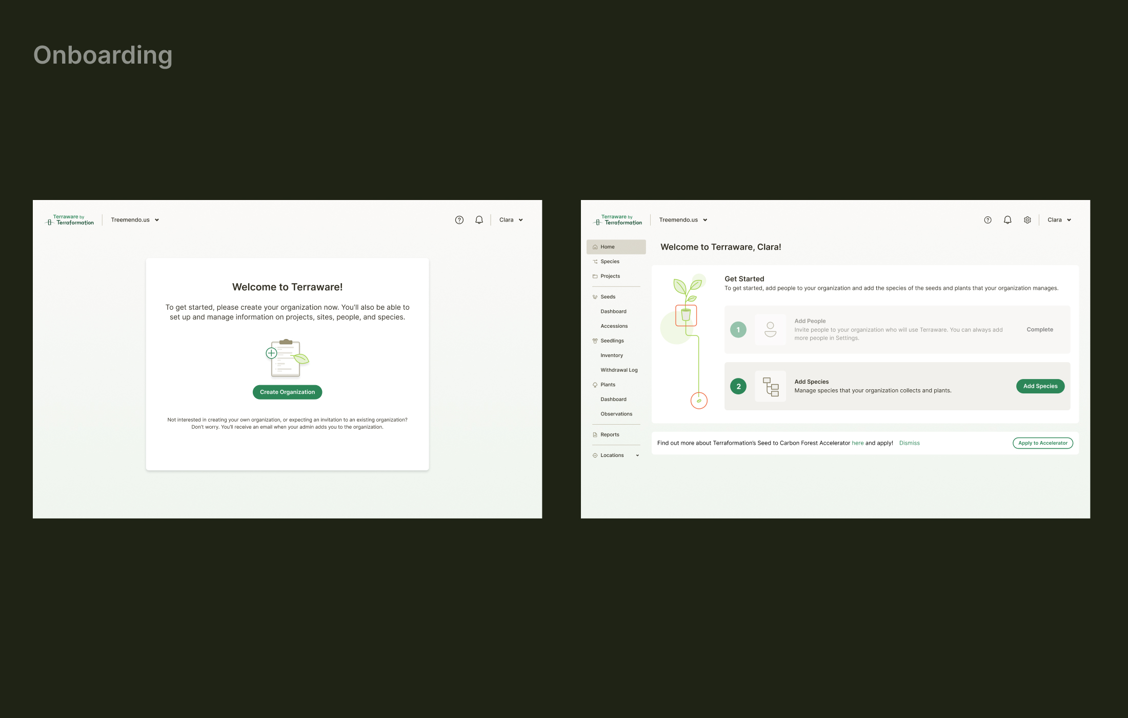
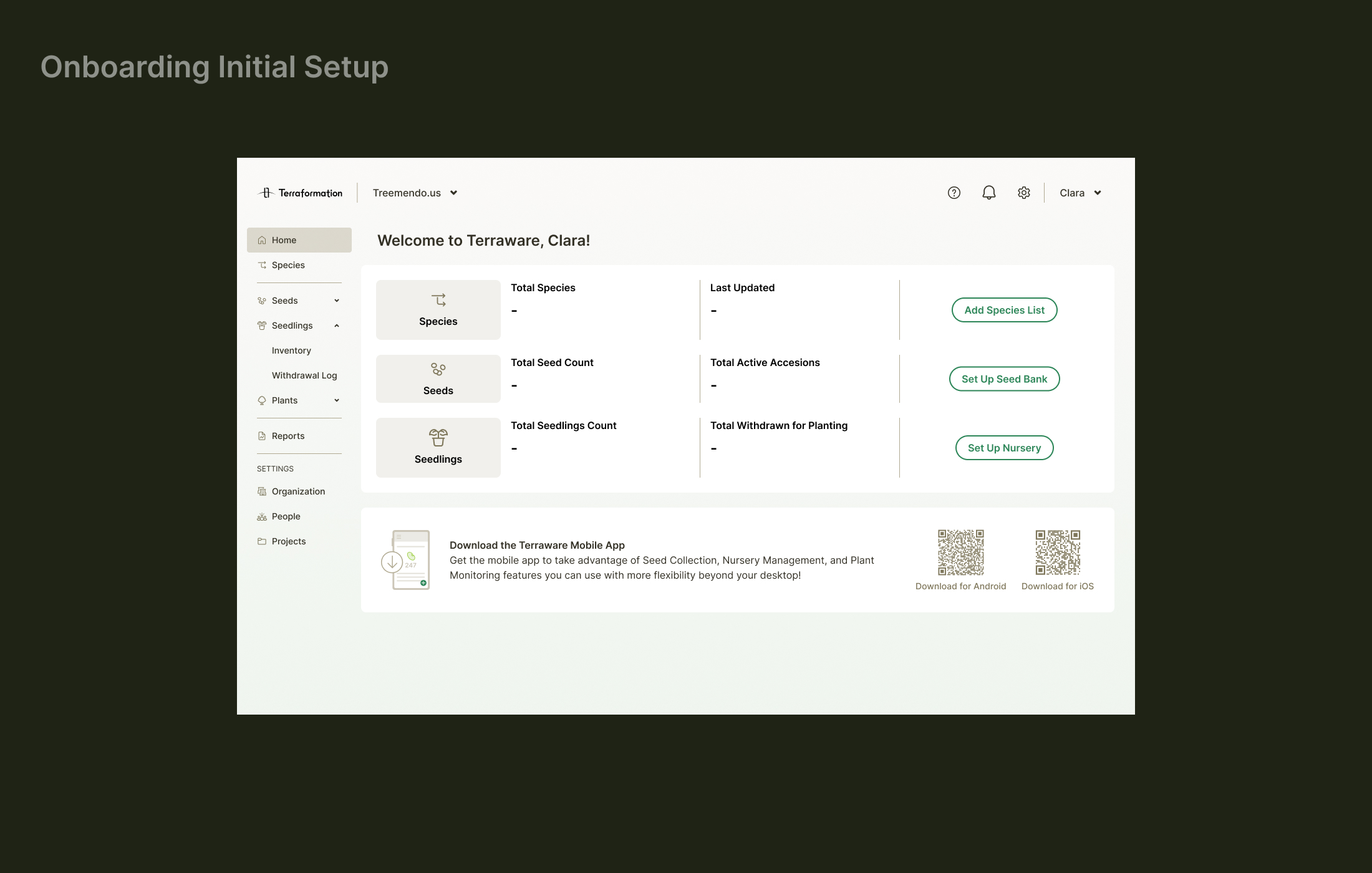
Onboarding Experience
I created an initial onboarding flow to help new users set up their seed banks, nurseries, and species lists. The empty state serves a functional setup purpose while guiding users through essential configuration steps.
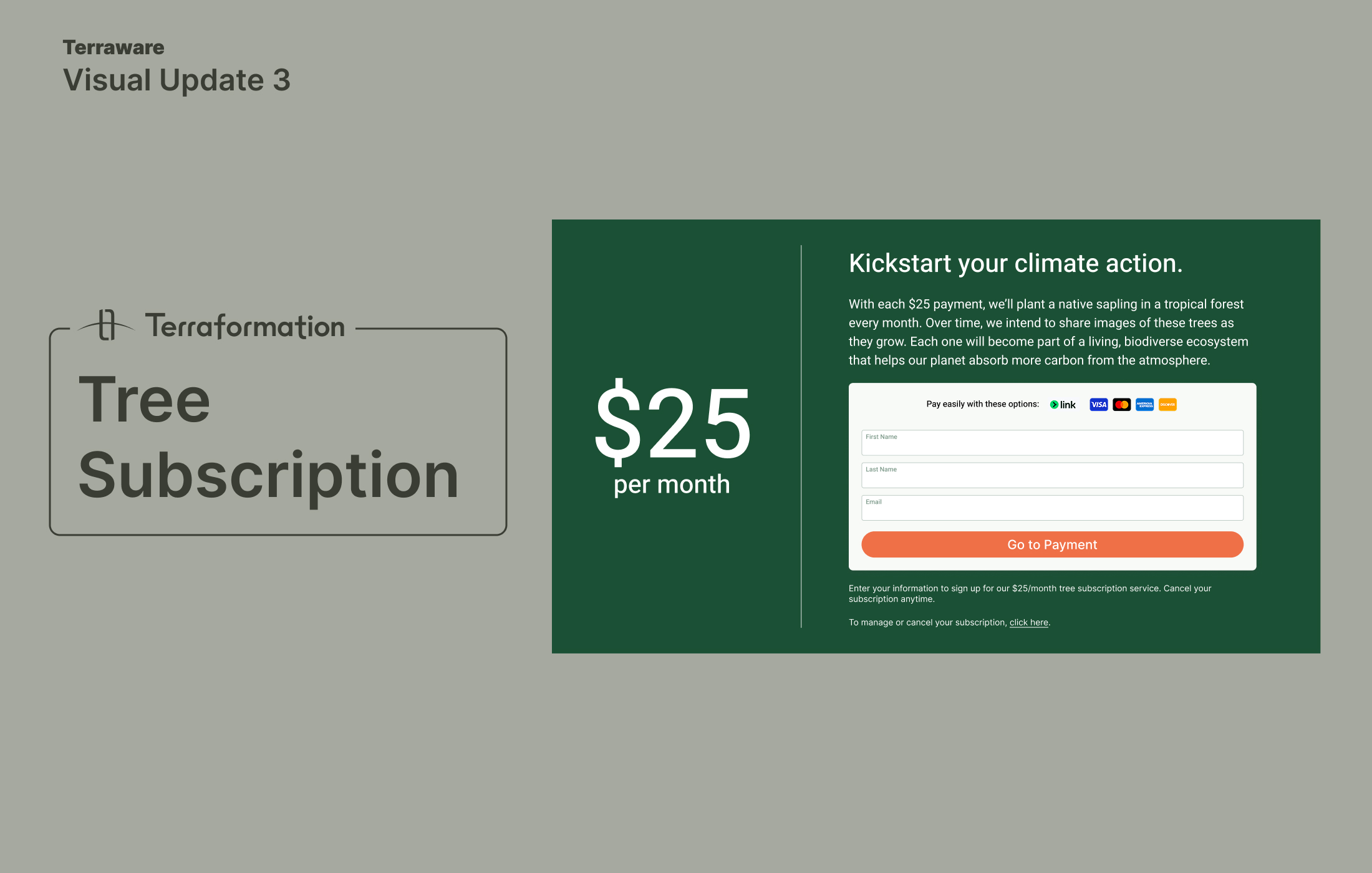
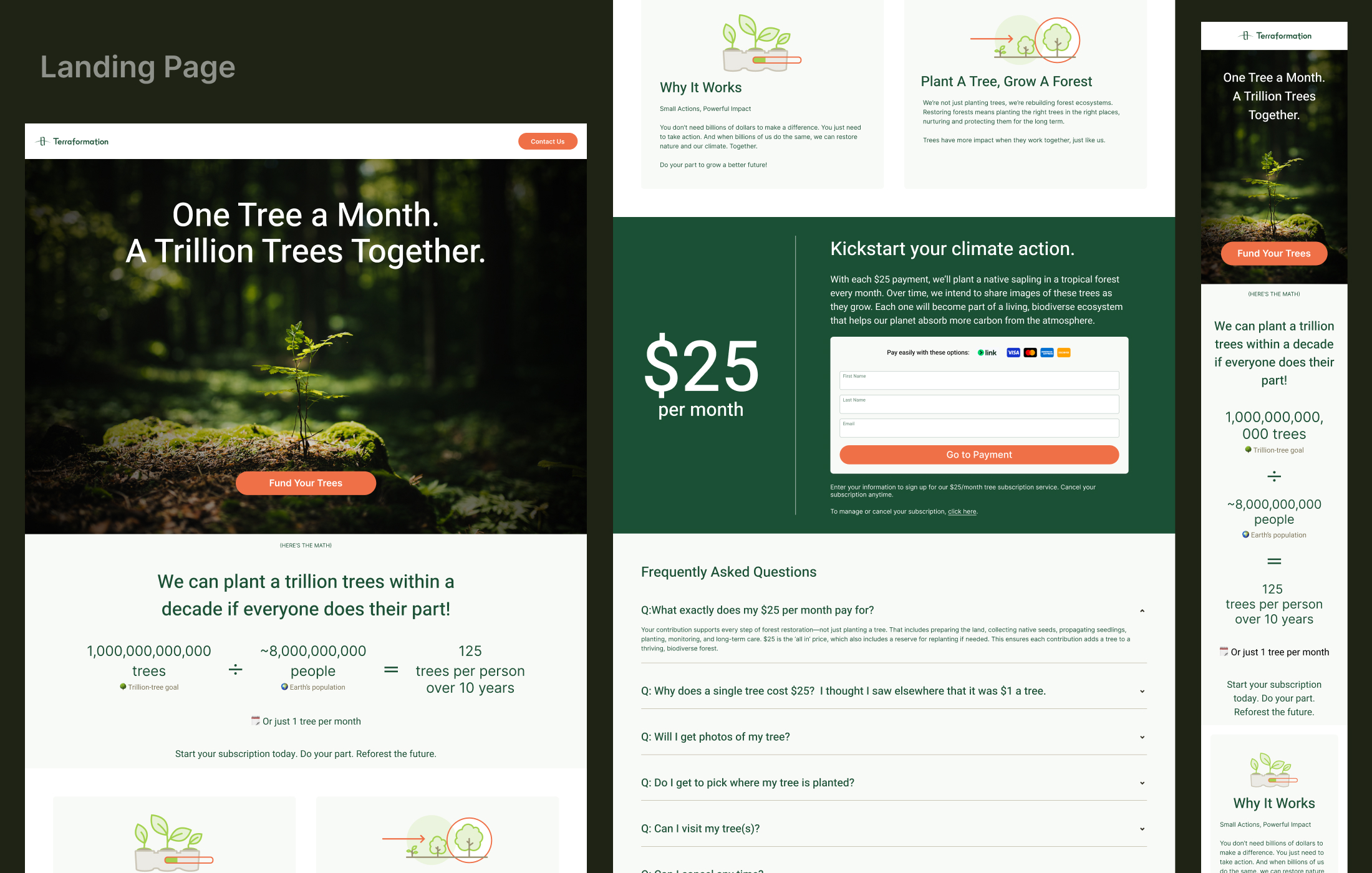
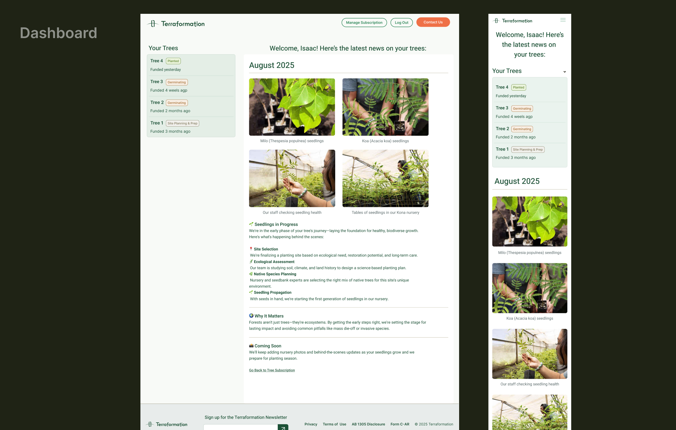
Tree Subscription Service
As part of Terraformation's consumer-facing initiatives, I designed a landing page for recurring tree sponsorships and a dashboard where users can view photos of their sponsored trees and manage their accounts.