Terraformation Activity Log MVP
Back to Projects67%
Feature Adoption Rate
179
Projects contributed activity in 30 days
49
Average activities uploaded
4x
Views on Funder Portal
The Challenge
Reforestation projects span months and years, involving complex activities across multiple sites. The Accelerator Team needed a way to capture these activities, track progress, and present meaningful highlights to funders in a compelling narrative format.
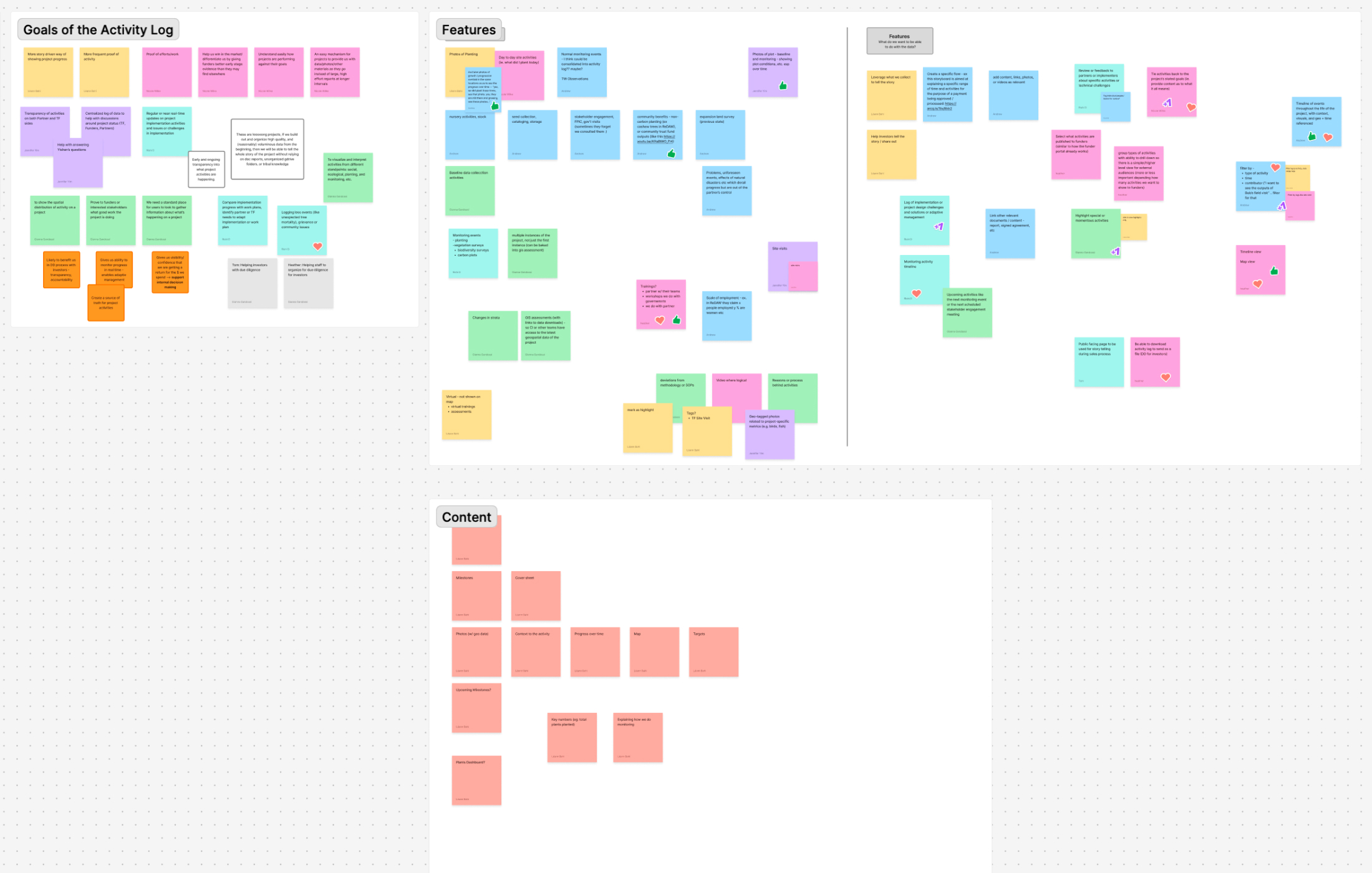
Research & Discovery
I collaborated with the product manager and Accelerator Team stakeholders to understand their workflows, establish goals, and define requirements. Through these sessions, we identified key user needs around storytelling, data visualization, and progress tracking.


Exploring Narrative Formats
I explored four distinct presentation formats to find the best way to tell the story of reforestation activities: a Photo Narrative with embedded metrics, a Storybook format with explanatory text, a Guided Tour pairing photos with a timeline and map, and a Highlight Focused layout with map as secondary. We selected the Guided Tour approach.
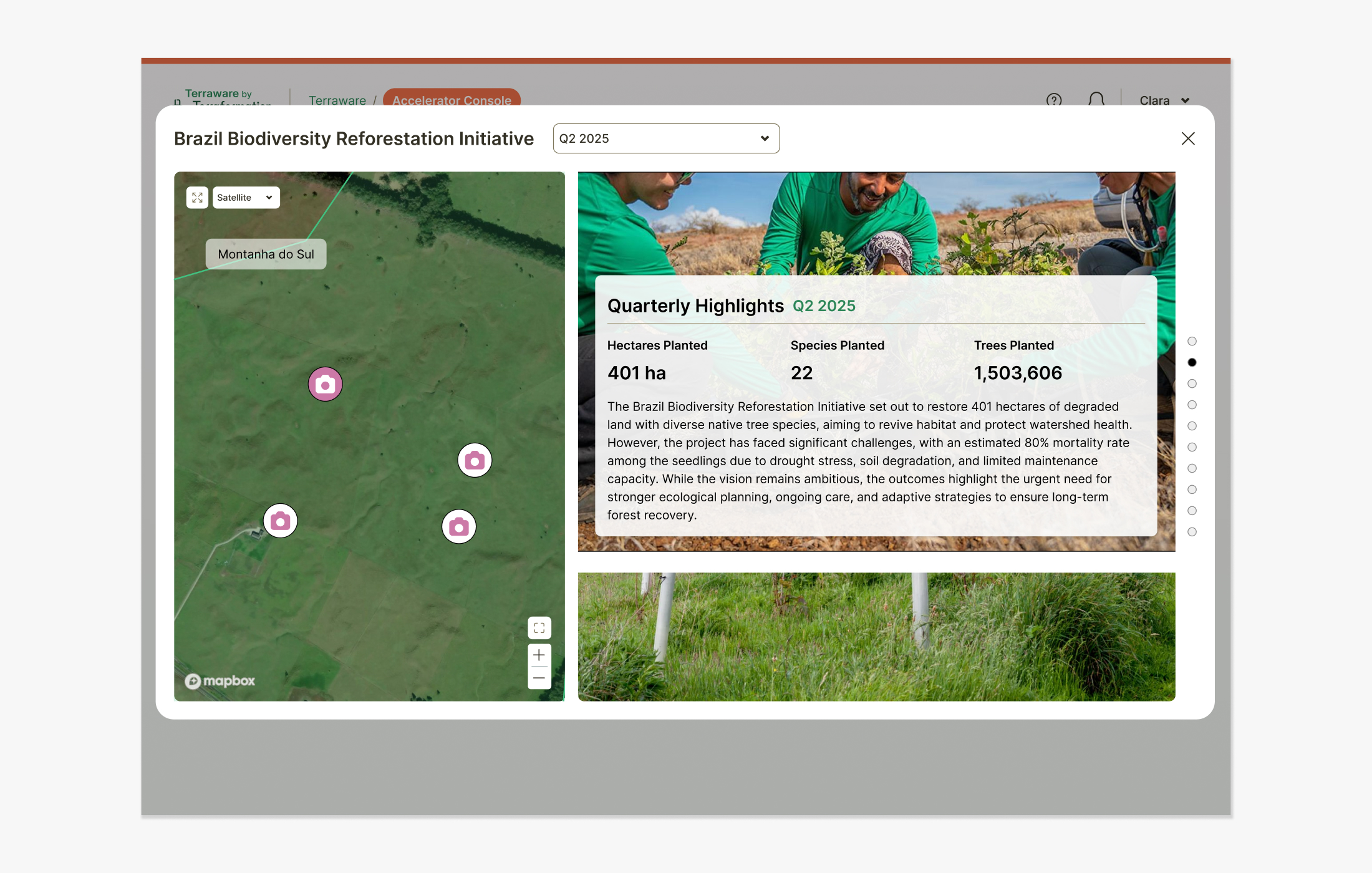
The Guided Tour Solution
The Guided Tour format presents photos and highlights as a slideshow paired with a dynamic map showing markers on the planting site. This approach connects activities to their physical locations while maintaining a compelling narrative flow for funders.
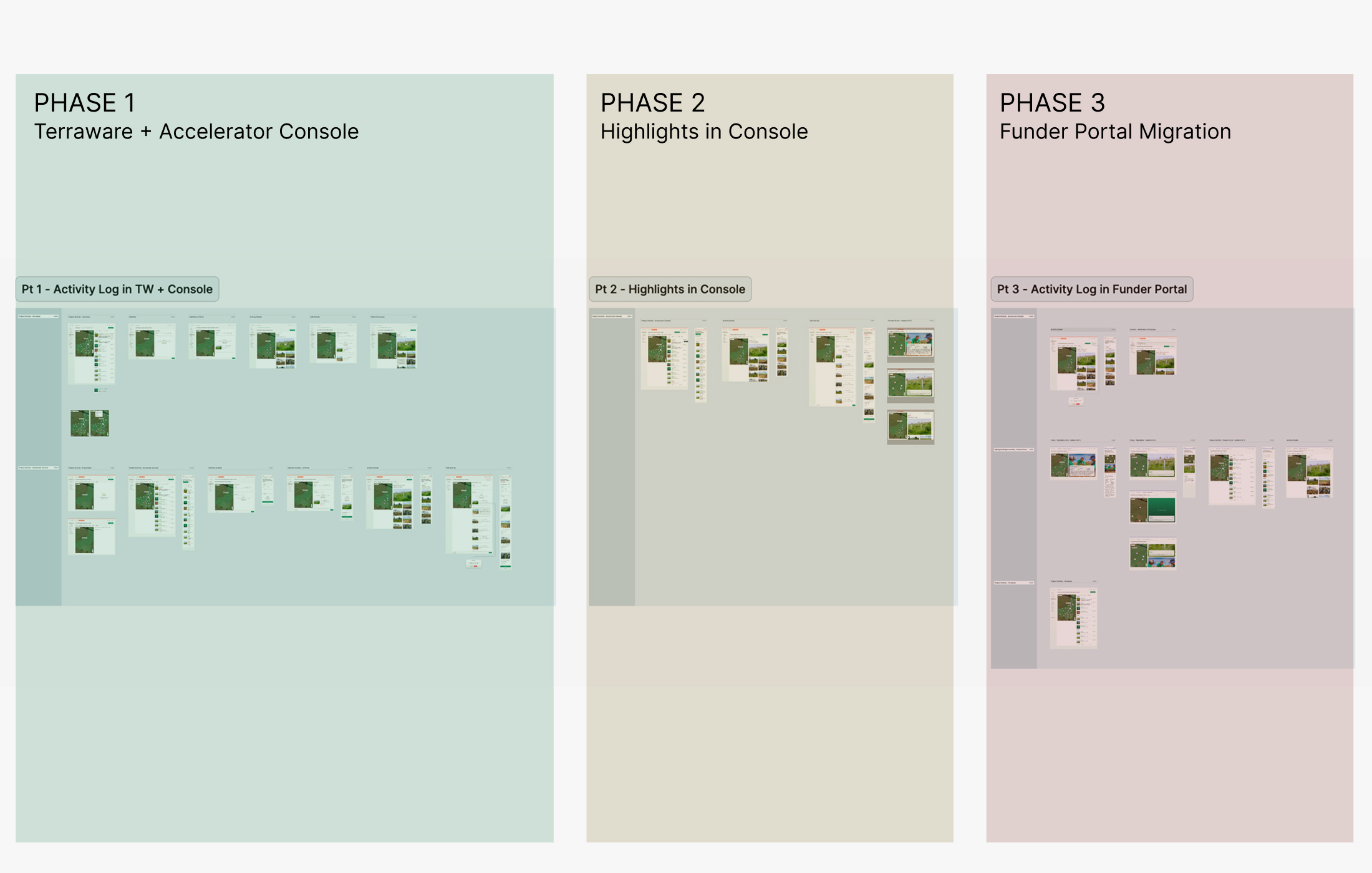
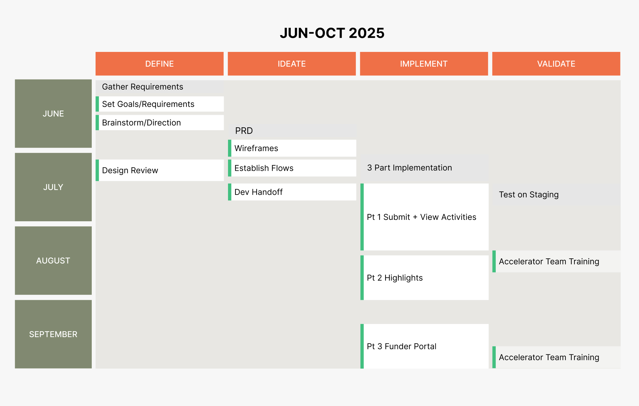
Phased Implementation
Given the scope of the feature and the number of teams it would touch, we broke the project into three phases. Phase one focused on core functionality — building the activity upload and management system directly into Terraware, the main platform used by reforestation teams. Phase two brought the feature into the Accelerator Console, giving internal teams the ability to review, curate, and preview the funder-facing slideshow before it went live. Phase three delivered the finished experience to the external Funder Portal, where potential funders could explore highlights from active reforestation projects across our network.
Slideshow Preview
The preview mode lets internal teams experience the funder-facing slideshow before publishing. It surfaces the full dynamic interaction — cycling through activity highlights, displaying photos, embedded video, and aerial drone footage from planting sites. The preview was essential for giving the Accelerator Team confidence in the narrative before it reached funders, and helped surface any ordering or content issues early in the review process.
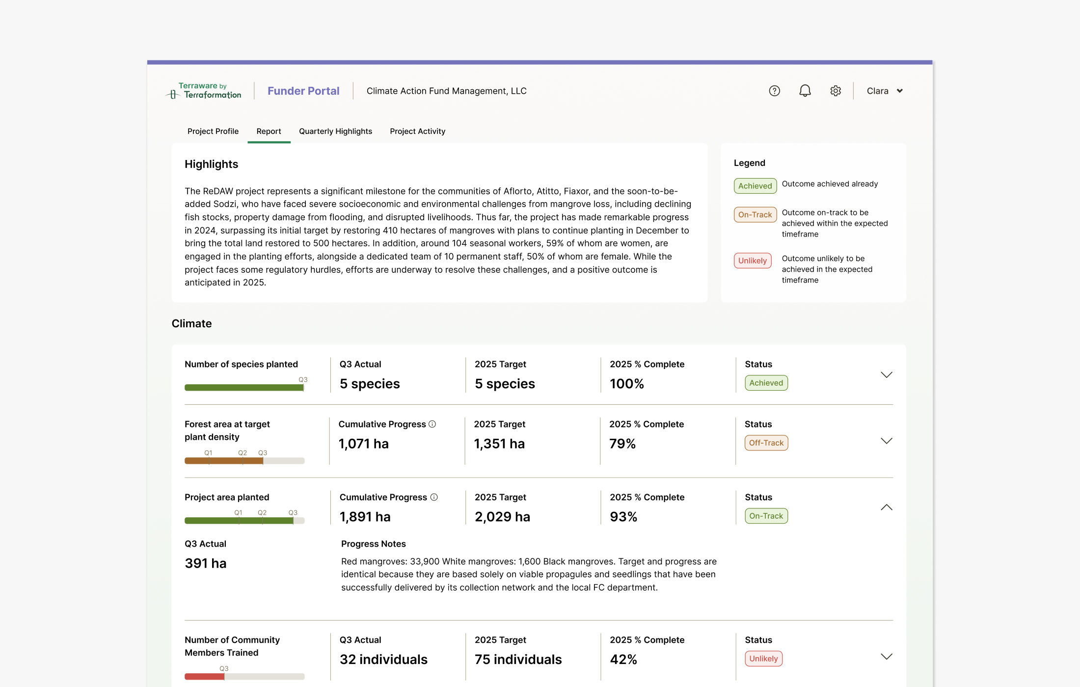
Quarterly Reports
In conjunction with Activity Reports, our Accelerator Team uses a Monitoring & Evaluation framework to report common indicators, data standards and workflows across all projects.
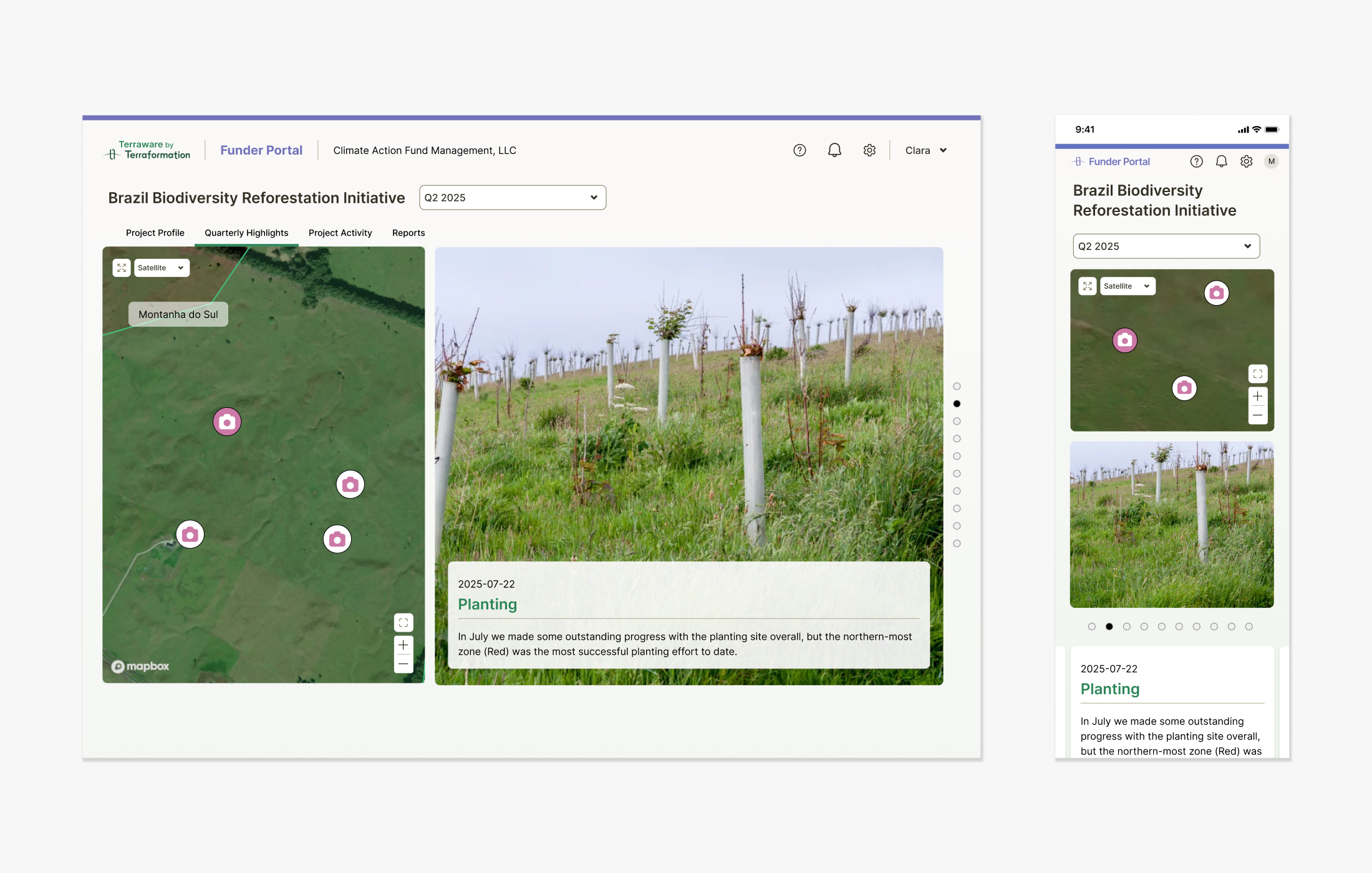
Funder Portal Highlights
The funder-facing view surfaces curated activity highlights alongside key project metrics — giving funders a compelling, at-a-glance narrative of a project's progress. Highlights are selected by the Accelerator Team and presented in a clean, scrollable format that emphasizes visual impact without requiring any technical understanding of the underlying data.
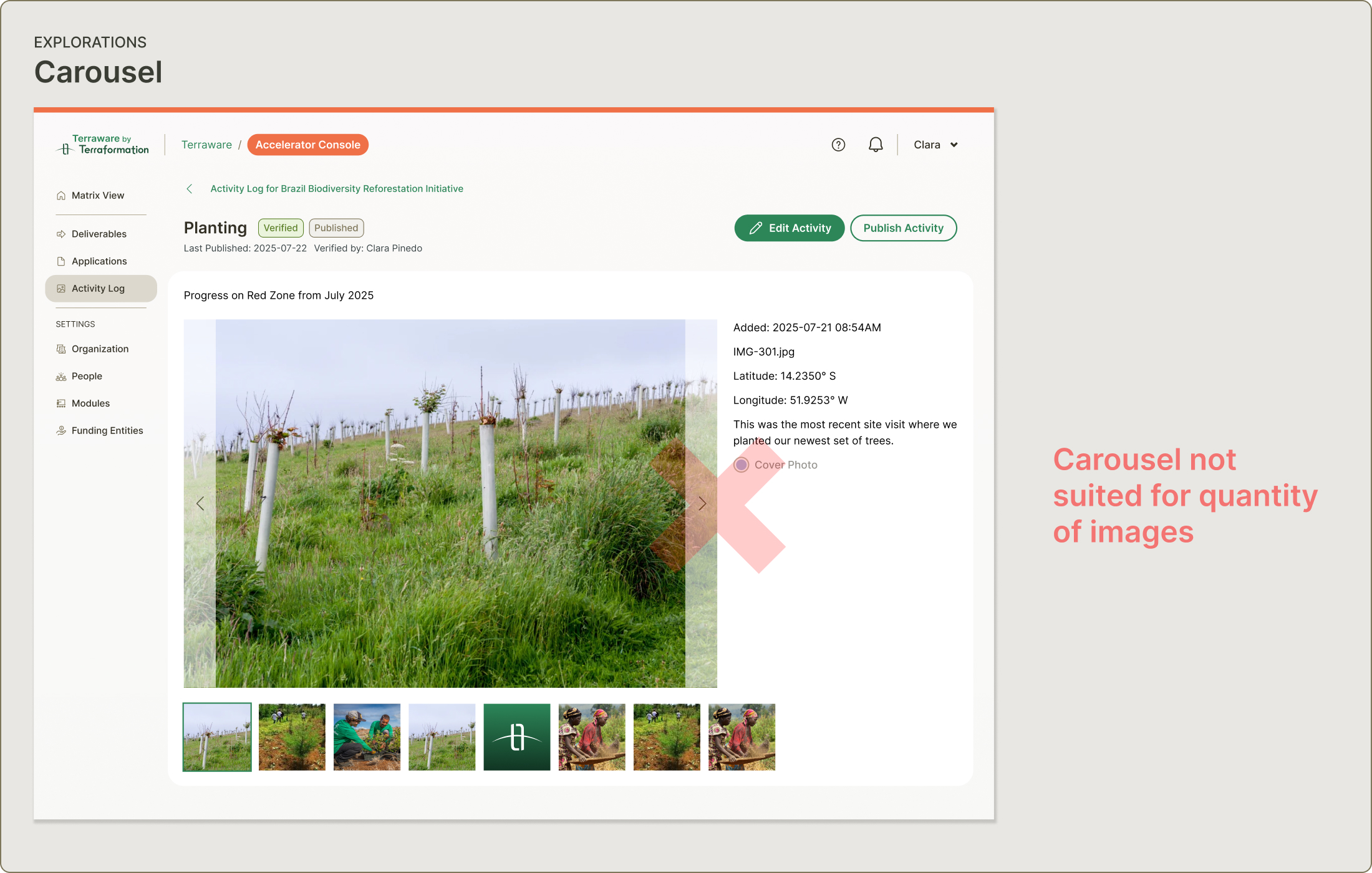
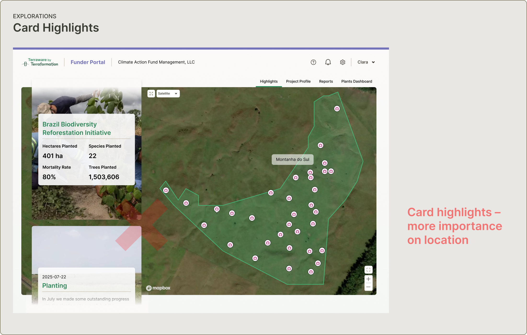
Initial Explorations
We explored two early directions before landing on the Guided Tour. A carousel format fell apart quickly — activities can have 50 or more images, making a horizontal scroll feel unwieldy and hard to navigate. A highlights reel with card-based layouts leaned into location context using existing map data, but subordinated the photography. High-quality images and drone footage were central to the story we needed to tell, so we needed a format that let them lead.

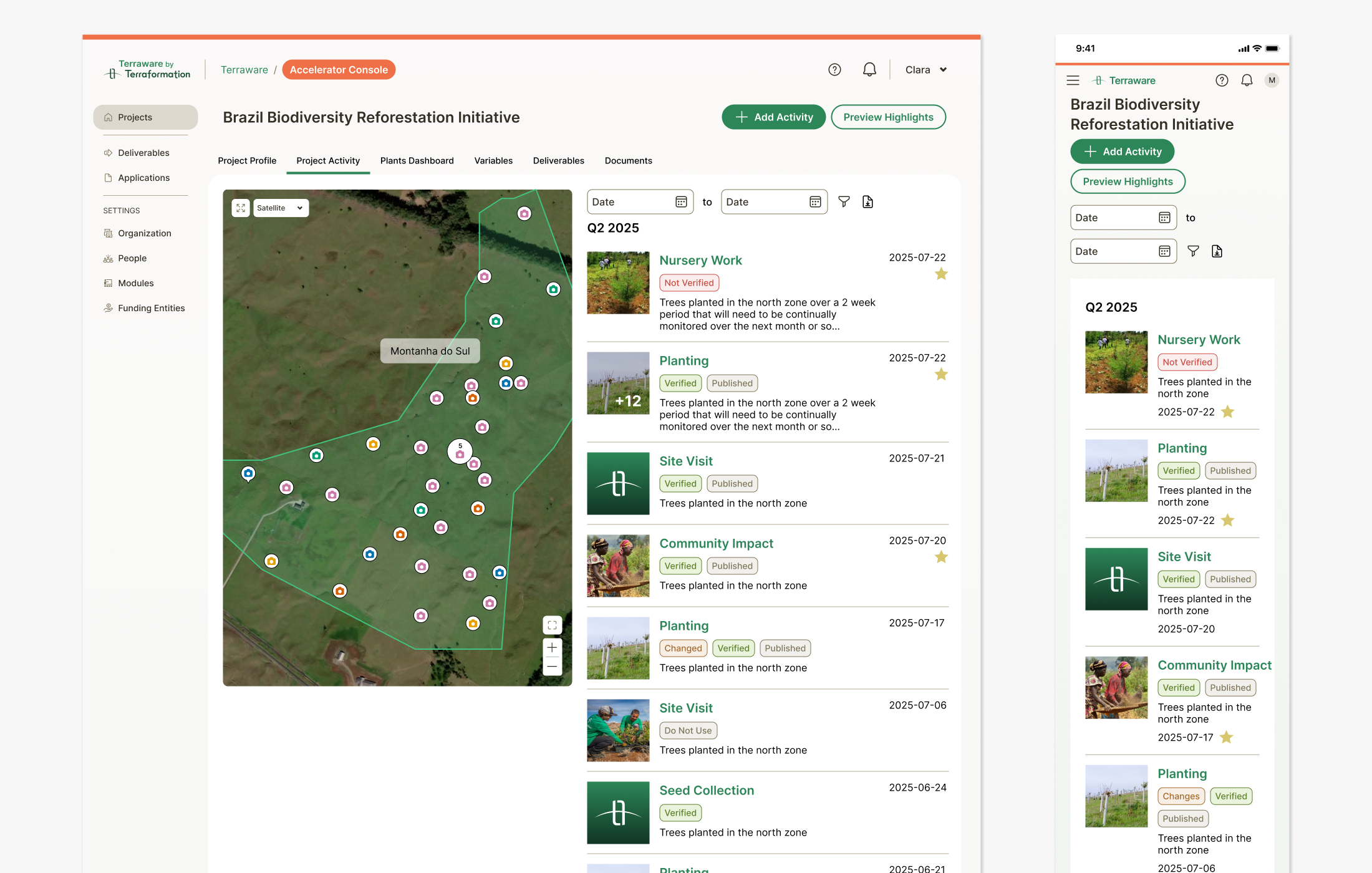
Accelerator Console Edit View
The edit view provides flexible visibility controls for various fields, making it easy for team members to add photos, descriptions, metrics, and location data for each activity. The management console follows CRUD best practices, allowing teams to upload activities by quarter — star indicators mark highlights and status tags help organize activities throughout the workflow.