Fountain Brand Identity
Back to Projects
Summary
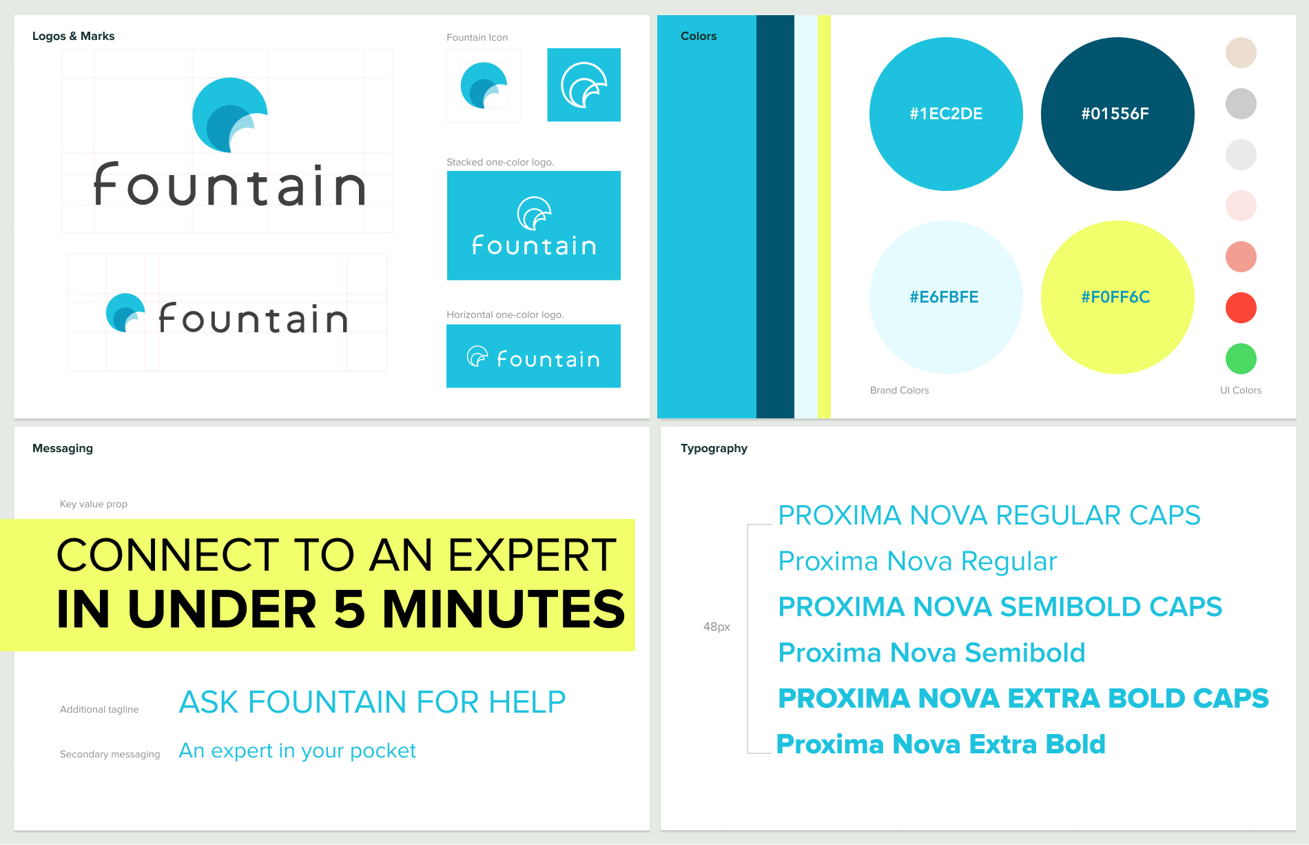
Brand Identity
The Fountain name was chosen to represent the wellspring of knowledge our product would provide. A cool, calming color palette helped make DIY projects feel less stressful while on the phone with an expert. A clean, bright aesthetic pushed trustworthiness with its modern approach and crisp, clear photography.
Logo Exploration
Early logo explorations for the Fountain brand.

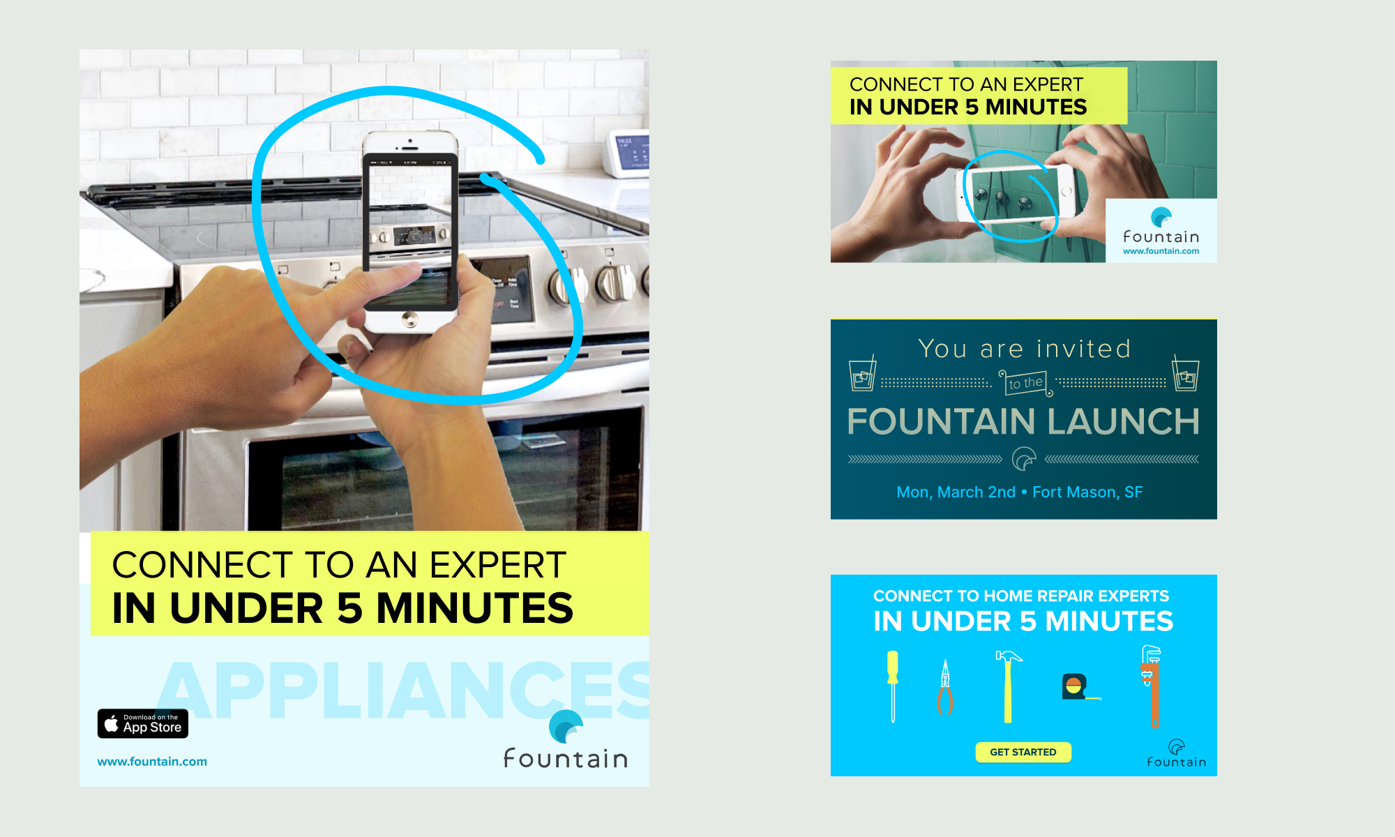
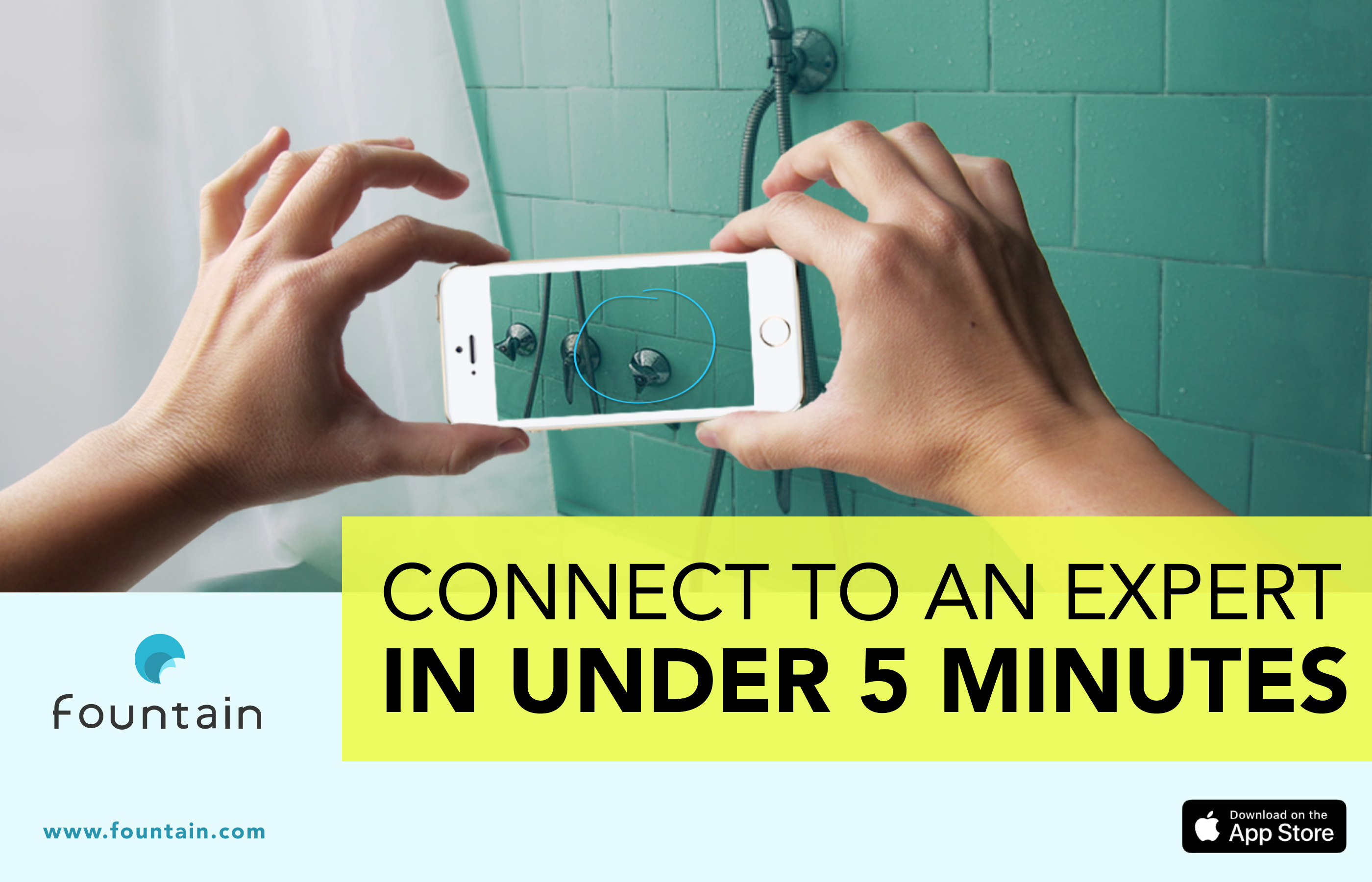

Fountain Ads
A series of ads highlighting key use cases of the app.

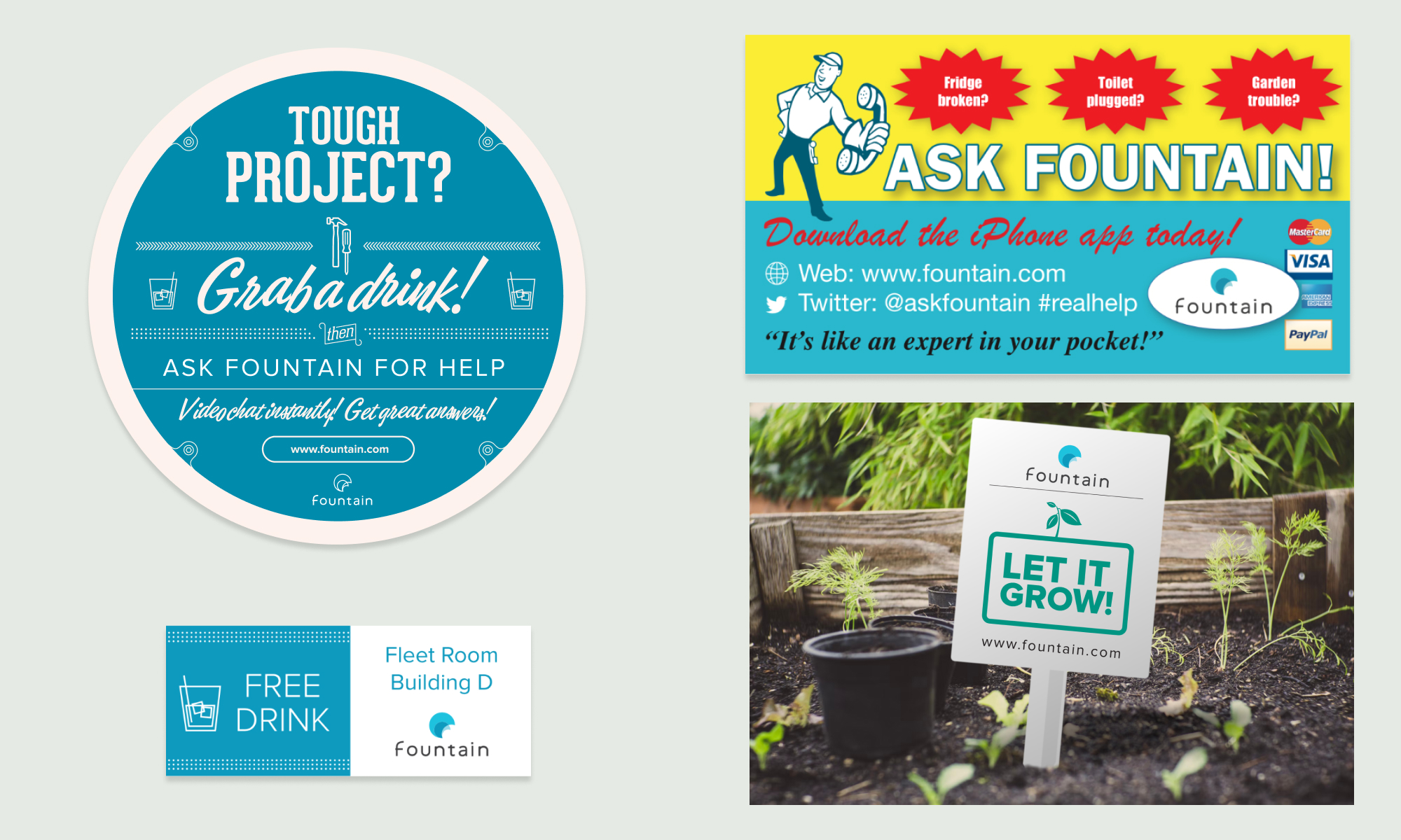

Collateral & Swag
T-shirts and event swag for TechCrunch Disrupt — coasters, kitschy magnets, and grow packets to promote the app beta launch.