Esalen Rebrand & Website
Back to ProjectsLogo Development
The logo draws from the original entrance sign, with refined letterforms and unified angular construction creating dynamic visual energy.

Brand Standards
A comprehensive guide covering brand colors, type hierarchy, logo usage, personas, and language tone to establish consistency across all media.

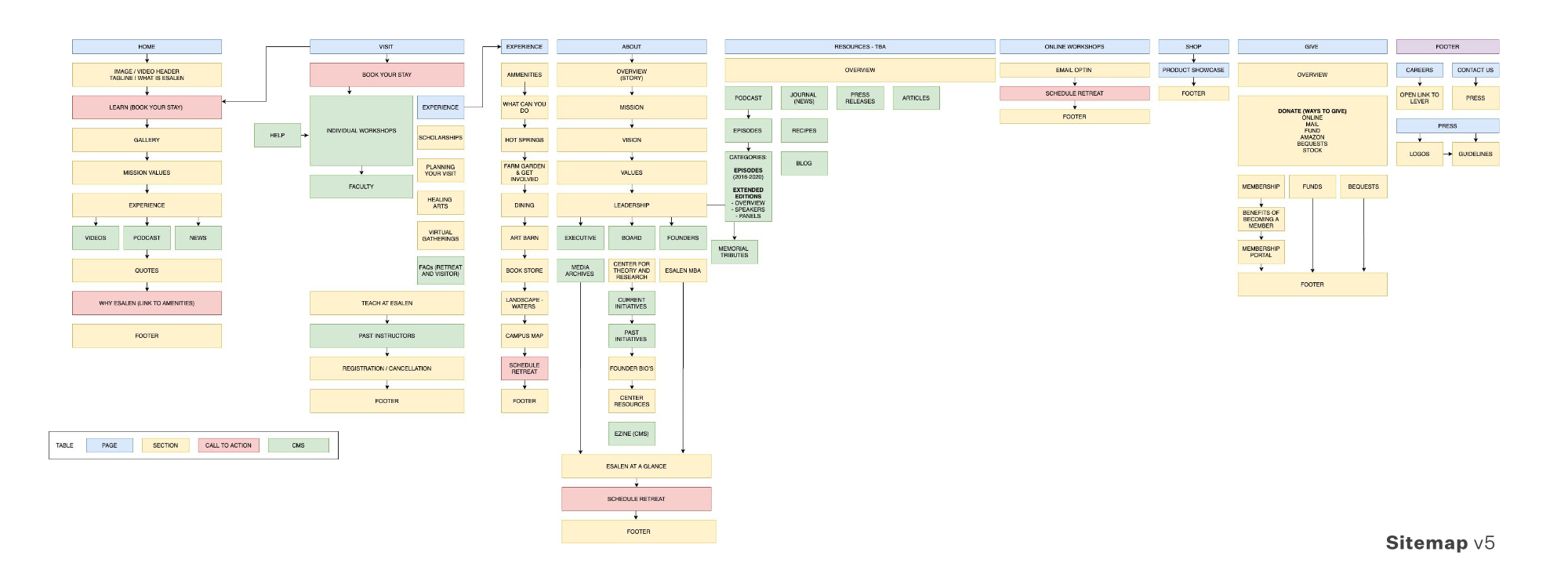
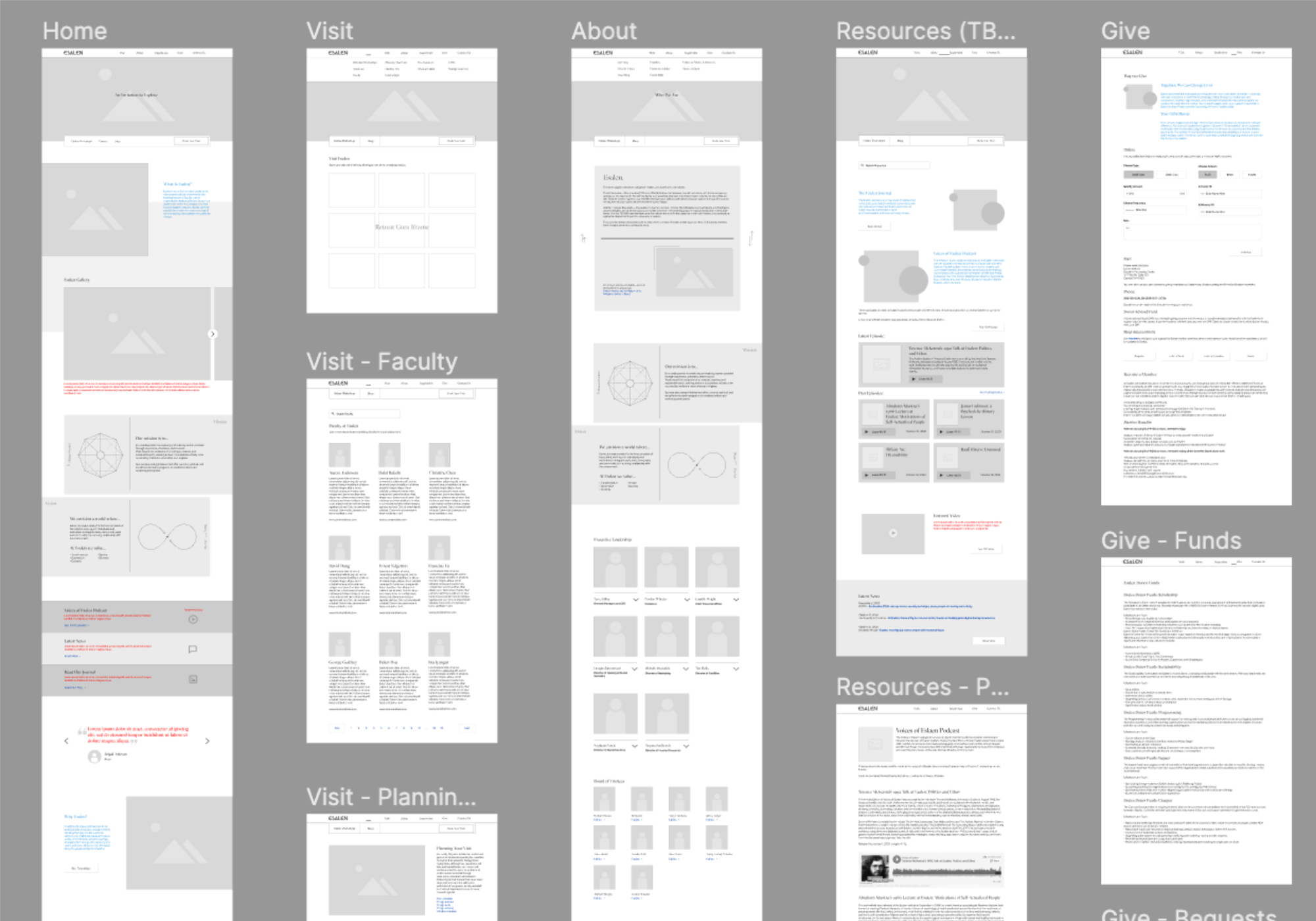

Website Redesign
The outdated site was transformed with a modernized design system, responsive layout, and revitalized photography archive while maintaining unique character across devices. The redesigned interface encourages exploratory browsing over rigid navigation, allowing users to discover content naturally — mirroring the experience of exploring Esalen's physical grounds.


Collateral Materials
The rebrand extended to merchandise including tote bags, wearables, posters, and water bottles featuring updated graphics. Social media templates and print materials reinforced the new visual identity across all touchpoints.